Answer the question
In order to leave comments, you need to log in
How to correctly lay out these blocks on bootstrap 4?
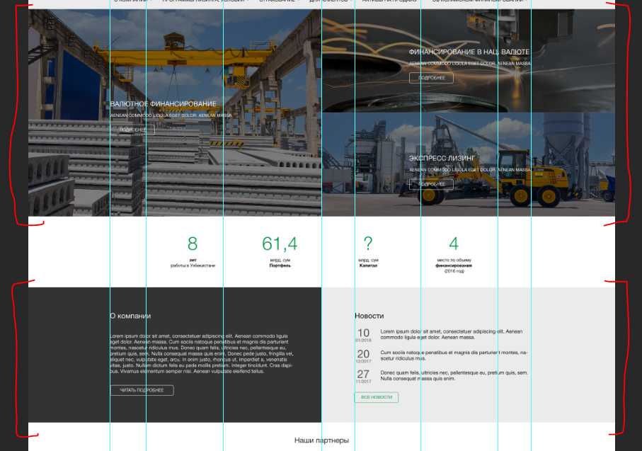
I apologize for my amateurish question. How can these two blocks be laid out on bootstrap 4 or so that they are adaptive.
In the first block, the images are laid out in a full-width grid, but how to enter text into them so that it does not go beyond the content zone (container).
In the second block, the structure is like this, but how to make the background go beyond the container?
<div class="container">
  <div class="row">
    <div class="col-md-6"></div>
    <div class="col-md-6"></div>
  </div>
</div>Answer the question
In order to leave comments, you need to log in
For the second section https://codepen.io/anon/pen/odzywr
For the first section, the same thing, only for wrapper set background-image
hello) the first screen on the bootstrap would be like this:
.container
- .row
-- .col-md-6.p0
--- .content
-- .col-md-6.p0
--- .row
---- . col-md-12.p0
------.content
-----.col-md-12.p0
------.content
.content would center via absolute pos. with negative transform: translate(-50%, -50%)
Didn't find what you were looking for?
Ask your questionAsk a Question
731 491 924 answers to any question