Answer the question
In order to leave comments, you need to log in
How to change the screen size in bootstrap when shrinking the menu?
In general, there is a need for the following.
It is necessary to change the screen size in the bootstrap at which the menu will shrink into an adaptive one.
How to implement it?
It is necessary to avoid the following:
fullscreen: 
in a window: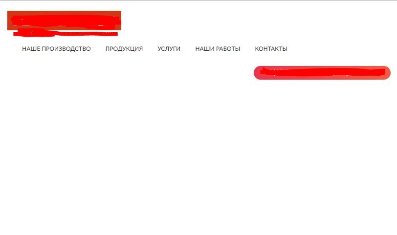
Answer the question
In order to leave comments, you need to log in
getbootstrap.com/customize/#grid-system
you need @grid-float-breakpoint parameter
Use @media screenit here in detail how to use it , I also advise you to use responsinator if you use OpenServer , then through it you can also do adaptation. I recommend using 4 options as suggested by bootstrap itself
Very small devices
Phones (<768px)
Small devices
Tablets (≥768px)
Medium devices
Desktop (≥992px)
Large devices
Desktop (≥1200px)
Didn't find what you were looking for?
Ask your questionAsk a Question
731 491 924 answers to any question