Answer the question
In order to leave comments, you need to log in
How to change the menu?
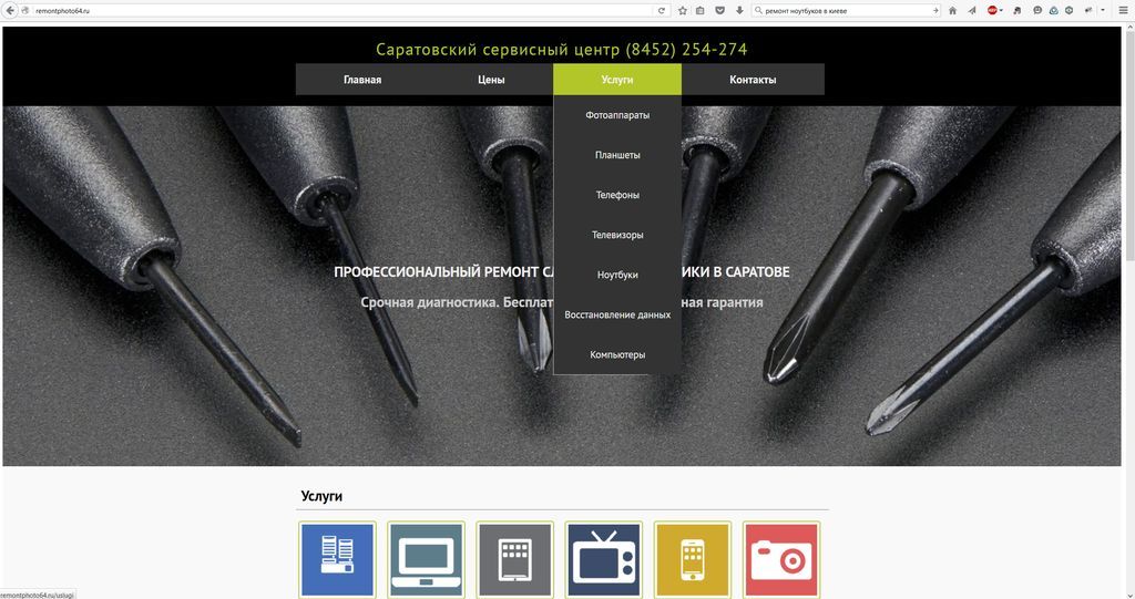
Good afternoon. Tell me how to organize navigation on the service center website well. Now all services are hidden in the depths of one menu item, which makes them inaccessible for quick entry, "makes the user think", and when new menu items are added, it risks turning into a completely sprawling baobab. If you put them in a separate horizontal line, they will be small and hard to read. You can remove the top prices, contacts and the main one by expanding the list of services, but where to put the prices and contacts that are obligatory in a conspicuous place? Completely confused. Help.
Answer the question
In order to leave comments, you need to log in
Now it's so good. If the list of services grows, remove the drop-down list. Make "Services" a link to the page with services, and display all services in any form on the services page.
If this is the main information on the site, then why not display them in a separate menu with illustrations? Like the picture below, only from above.
Yes, and prices with contacts can be put on the page of each service. Then the site menu can be reduced to only services.
Didn't find what you were looking for?
Ask your questionAsk a Question
731 491 924 answers to any question