Answer the question
In order to leave comments, you need to log in
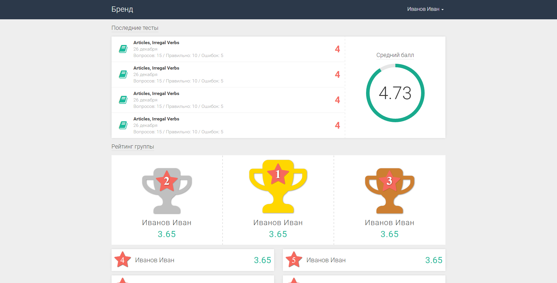
How to change the design to be beautiful?
–Т—Б–µ–Љ –њ—А–Є–≤–µ—В. –Ф–µ–ї–∞—О –љ–µ–±–Њ–ї—М—И–Њ–є –ї–Њ–Ї–∞–ї—М–љ—Л–є —А–µ—Б—Г—А—Б –≤ —Б—В–Є–ї–µ material design. –Э–Њ –µ—Б—В—М –љ–µ–±–Њ–ї—М—И–∞—П –њ—А–Њ–±–ї–µ–Љ–∞ –≤ –і–Є–Ј–∞–є–љ–µ.
"–Я–Њ—Б–ї–µ–і–љ–Є–µ —В–µ—Б—В—Л" –Є "–†–µ–є—В–Є–љ–≥ –≥—А—Г–њ–њ—Л" –Ї–∞–Ї –њ–Њ –Љ–љ–µ –љ–µ —Б–Њ—З–µ—В–∞—О—В—Б—П. –Ъ–∞–Ї –ї—Г—З—И–µ –Њ—Д–Њ—А–Љ–Є—В—М –і–∞–љ–љ—Г—О —Б—В—А–∞–љ–Є—З–Ї—Г, —З—В–Њ–±—Л –±—Л–ї–Њ –Ї—А–∞—Б–Є–≤–Њ –Є —Б–Њ –≤–Ї—Г—Б–Њ–Љ?
P.S –°–≤–µ—А—Е—Г —Б–њ–Є—Б–Њ–Ї –њ—А–Њ–є–і–µ–љ–љ—Л—Е —В–µ—Б—В–Њ–≤ –Є –Ї–∞–Ї–∞—П –Њ—Ж–µ–љ–Ї–∞ –Ј–∞ –Ї–∞–ґ–і—Л–є —В–µ—Б—В –њ–Њ–ї—Г—З–µ–љ–∞. –°–њ—А–∞–≤–∞ —А–µ–є—В–Є–љ–≥ –љ–∞ –≤—Б–µ–Љ –њ—А–Њ—В—П–ґ–µ–љ–Є–Є –≤—Л–њ–Њ–ї–љ–µ–љ–Є—П —В–µ—Б—В–Њ–≤. –°–љ–Є–Ј—Г —А–µ–є—В–Є–љ–≥ –≤—Б–µ–є –≥—А—Г–њ–њ—Л. –†–∞—Б–њ–Њ–ї–Њ–ґ–µ–љ –±—Г–і–µ—В –њ–Њ –≤–Њ–Ј—А–∞—Б—В–∞–љ–Є—О —Б—А–µ–і–љ–µ–≥–Њ –±–∞–ї–ї–∞. –Ъ–∞–Ї –њ—М–µ–і–µ—Б—В–∞–ї –њ–Њ—З–µ—В–∞ —Б –Љ–µ—Б—В–∞–Љ–Є
Answer the question
In order to leave comments, you need to log in
Regarding the first option:
1. Headers of the blocks should stand out (since they are gray and small, they are slightly lost), you need to make them larger and possibly fatter or change the color (say, to black). The main thing is that the user should be visually clear what these blocks are.
2. you need to increase the distance between the "Latest tests" block and the "group rating" block, you shouldn't put them so close to each other
3. The last tests block - it's not clear that the red numbers can be a grade / score. You need to indicate this visually (for example, write a score / score: 4 - here you can show it in different ways, the main thing is to make it clear that this is a score, and not just a number).
- It is better to replace the red color of the score / score with another one, say black or turquoise, as the color of the icons. Since the red color will be too distracting. This is more of a subjective factor, here it's up to you.
4. Average score. Highlight the title, it's barely noticeable. Here I would fill the circle with a soft red color, approximately like the color of the stars (here it is more at my discretion, the main thing is to make it clear that this is a graph) and I would make the circle slightly thicker.
- the numbers in the circle need to be slightly reduced.
5. Block "Group rating". Icons - if you take material design as an example, then it is better to follow the style itself, for example https://www.iconinder.com/search/?q=reward&type=v...
it is better to remove and reduce the shadows of the icons (since they already stand out by themselves (due to the color), it's okay if they are smaller). The main thing is to highlight the names of the winners, make them bigger, like the score itself. As for the color of the goblets, you can experiment, the main thing is not to get out of the general style)
6. Perhaps, as people mentioned earlier, it is worth placing the goblets from left to right (gold, silver, bronze). Since we read from left to right, it will be correct from the point of view of usability, but this is a subjective assessment)
7. Rating of other people. Asterisks are better not to do, as they divert attention to themselves, here the emphasis is on people, or rather on their names and rating / score. The main thing is to be able to see what place, who took it and what score he has. The rest of the elements will be redundant.
As for the second option:
this is not a sporting event (if I understood correctly :)), but rather the sphere of education, therefore I personally do not see the point in the pedestal (but this is my subjective assessment). In any case, this pedestal draws too much attention to itself, and on a page where there is a lot of information, it is better not to do this. Therefore, the first option fits better)
Well, it's all a matter of taste, of course. )
1) Group ratings (cups) take away the view. Maybe it's better to swap them with the latest tests.
2) The left cup (gray) looks like an inactive picture. Perhaps it makes sense to line them up in order 1st place, 2nd place, 3rd place. We read from left to right. Due to the increase in the picture, it was not possible to achieve the positioning of the first place.
3) Perhaps this is just a template, but still 4 out of 4 will give an average score of 4. If you summarize the results that are not displayed, then it is better to take out the Average score separately. Yes, and the numbers 4 are too pressed to the average ball. First, the average score will go, and below (or on the right) there is already a list that influenced the average score.
I would change the actual cups, because. their design looks gaudy (red star on yellow? seriosly?) and out of style. Plus, they're too big, especially the yellow ones. slightly reduce, make more adequate colors, and highlight the winner more calmly - for example, by increasing the middle block itself by 5-10 pixels.
Didn't find what you were looking for?
Ask your questionAsk a Question
731 491 924 answers to any question