Answer the question
In order to leave comments, you need to log in
How to center footer elements in mobile version?
Now in the desktop version the footer looks like this:
in the mobile version it looks like this:
How to make the line with the phone and social icons displayed in the center in the mobile version?
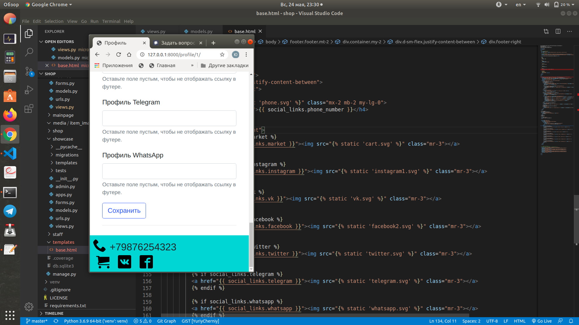
The current implementation looks like this:
<footer class="footer mt-2">
    <div class="container my-2">
      <div class="d-sm-flex justify-content-between">
        <div class="footer-left">
          <div class="row">
            <img src="{% static 'phone.svg' %}" class="mx-2 mb-2 my-lg-0">
            <h4 class="my-auto">{{ social_links.phone_number }}</h4>
          </div>
        </div>
        <div class="footer-right">
          {% if social_links.market %}
          <a href="{{ social_links.market }}"><img src="{% static 'cart.svg' %}" class="mr-3"></a>
          {% endif %}

          {% if social_links.instagram %}
          <a href="{{ social_links.instagram }}"><img src="{% static 'instagram1.svg' %}" class="mr-3"></a>
          {% endif %}

          {% if social_links.vk %}
          <a href="{{ social_links.vk }}"><img src="{% static 'vk.svg' %}" class="mr-3"></a>
          {% endif %}
        </div>
      </div>
    </div>
</footer>Answer the question
In order to leave comments, you need to log in
Use the justify-content-center class to center content.
Also don't forget that justify-content can be used with sm | md | lg | xl .
That is, to make justify-content-center only for screens <576px, and leave justify-content-between for the rest, you need to do this:
<div class="d-flex justify-content-center justify-content-sm-center">Didn't find what you were looking for?
Ask your questionAsk a Question
731 491 924 answers to any question