Answer the question
In order to leave comments, you need to log in
How to build such a grid?
White empty edges should remain on the site (for example, let's set 40px in a fix)
Images should be stretched for the rest of the width (1200px) with a certain interval between themselves
. Further, for the next text part (say, 1000px), the width of the site narrows again.
Let's say we're using a 12-column grid with a width of 1200px.
But then it is already more difficult to place information in three rows in the remaining 10 columns. In addition, the column spacing used for the 1200 width is already inconvenient.
How to proceed in such a case?
Use two grids in some way? Or abandon it altogether?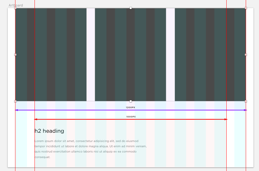
Answer the question
In order to leave comments, you need to log in
In your layout, you can clearly see the one-column indent for the second block and the absence of these indents for the first, it’s not clear what the question is.
Does it have 10 columns in the layout? If yes, then it is not clear what the difficulty is. If the question is asked from the point of view of the designer, then divide inside with other intervals if you consider it necessary. This complicates the layout, but not critically.
Again, it's not clear what you mean. If within 10 columns in the layout the column spacing is not on the grid, build another grid inside with display: flex yourself. It all depends on the section, you don’t see such problems on the screen.
Didn't find what you were looking for?
Ask your questionAsk a Question
731 491 924 answers to any question