Answer the question
In order to leave comments, you need to log in
How to build a chart in Excel using this table?
There is such a table.
I would like to build a graph that would have a line showing how the CTR bar changes depending on the Position bar - how to do this?
Well, then it is necessary, probably, somewhere, some average values \u200b\u200bto be deduced and only then to build a graph? I don't understand how to go about this...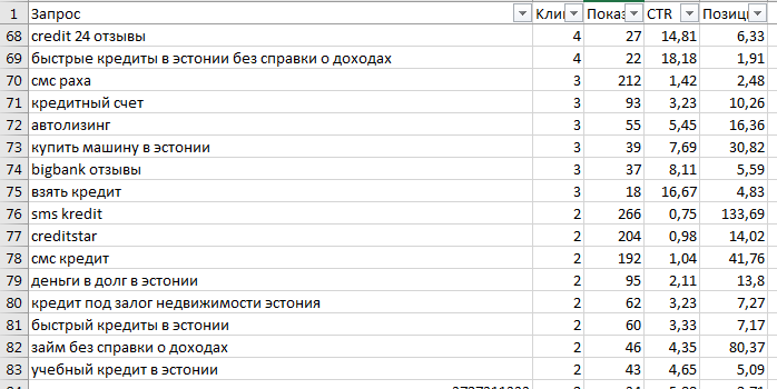
Answer the question
In order to leave comments, you need to log in
Sort by X -> X Y scatter chart -> Trendline. We will see both the distribution, the scatter, and the dependence itself.
Or
the Pivot Table -> in the rows position, in the STR data, we average the data -> any convenient chart. We will see the average dependence, if any.
Another variant of non-graphical analysis:
Function =correl() -> both columns as parameters -> the closer the number is to 1 or -1, the greater the connection. But here mb data normalization is required
Didn't find what you were looking for?
Ask your questionAsk a Question
731 491 924 answers to any question