Answer the question
In order to leave comments, you need to log in
How does adding multiple classes for columns work? Why are there more than 12?
Sorry for the noob questions.
In the examples at site this code:
<div class="row">
  <div class="col-xs-12 col-md-8">.col-xs-12 .col-md-8</div>
  <div class="col-xs-6 col-md-4">.col-xs-6 .col-md-4</div>
</div><!-- Stack the columns on mobile by making one full-width and the other half-width -->Answer the question
In order to leave comments, you need to log in
Look at the bootstrap documentation, it clearly states that xs md sm lg are classes for different display widths. Respectively
I will form the width of the block in accordance with the current screen width.
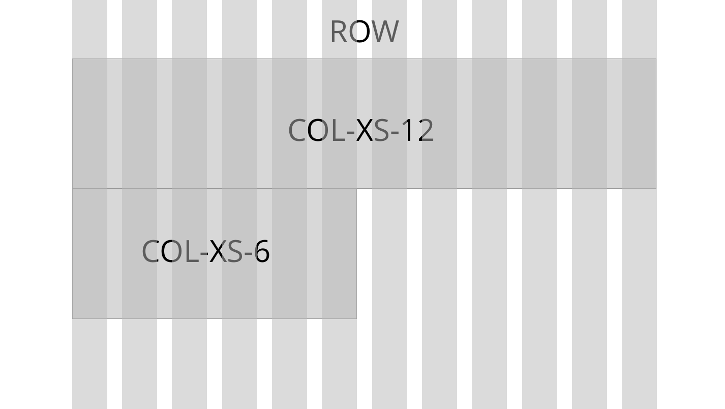
And this design will make one block 12 columns wide, and the second block below it 6 columns wide.
<div class="col-xs-12">
  <div class="col-xs-6">
Look, xs - extra small devices, sm - small, md - medium, lg - large, so when you set md and xs - md will always work, until the screen size becomes extra ss - 768 (sort of like in bootstrap), it turns out that in your example
<div class="col-xs-12 col-md-8">.col-xs-12 .col-md-8</div>
<div class="col-xs-6 col-md-4">.col-xs-6 .col-md-4</div><div class="col-sm-6 portfolio__item">
...
</div>
<div class="col-sm-6 portfolio__item">
...
</div>
<div class="col-sm-6 portfolio__item">
...
</div>
<div class="col-sm-6 portfolio__item">
...
</div>
Didn't find what you were looking for?
Ask your questionAsk a Question
731 491 924 answers to any question