Answer the question
In order to leave comments, you need to log in
How does a white field fit on a black background?
I am doing my first job (portfolio, not commercial). He says so - I stuff my hand.
Faced such a situation - a white field on a black background. I can't understand if such a combination (a white field on a dark background) is acceptable on this page?
Answer the question
In order to leave comments, you need to log in
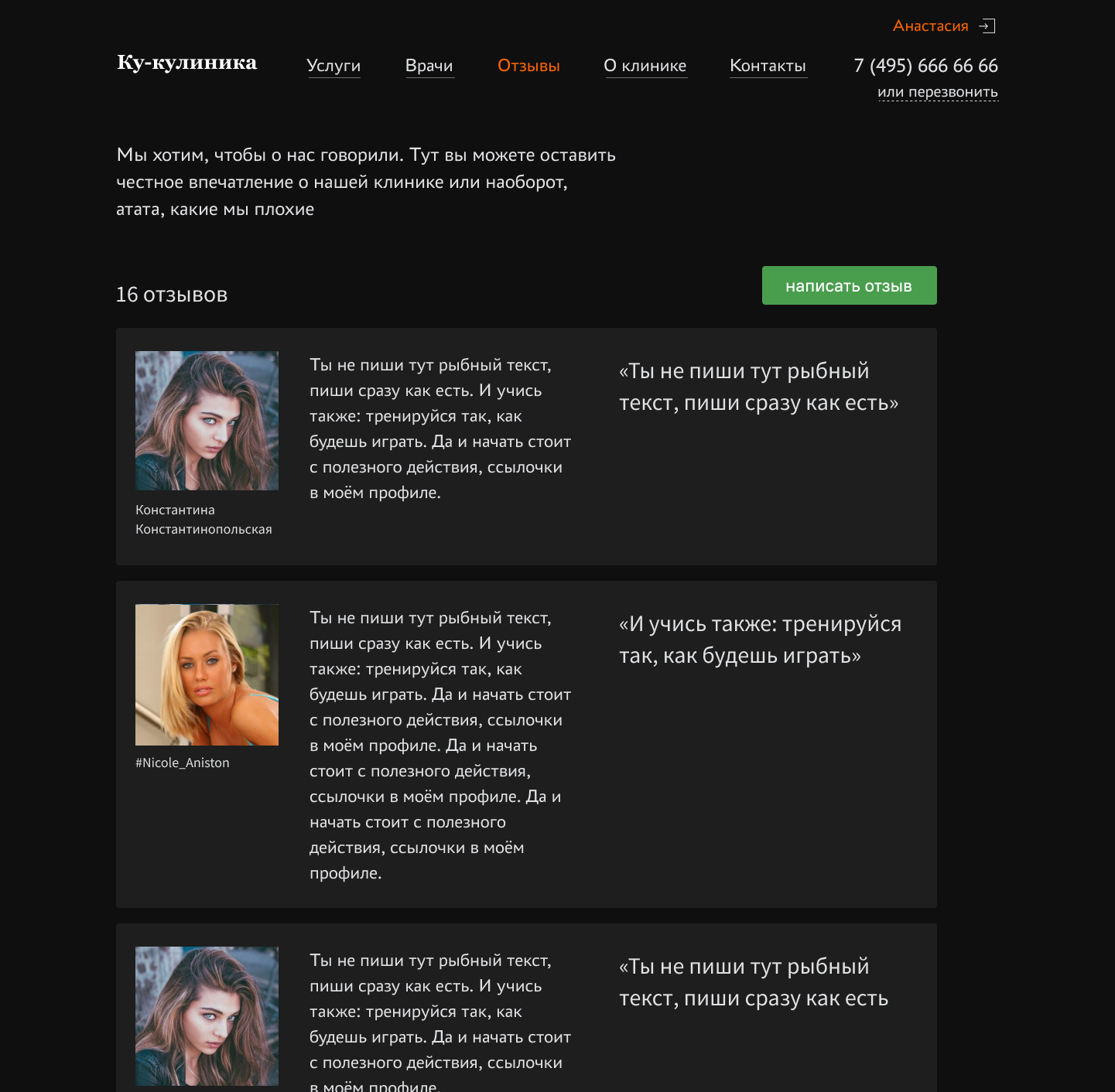
There are plenty of other problems here.
1. The avatar circle anchors too much, you need to make the figure simpler - a square. And the face itself is enlarged, now the avatar has ceased to be something foreign
2. You must immediately take into account different reviews: long, short. You have the same plates on the layout, but in reality this does not happen, unless the reviews are fake
3. You need to immediately take into account the width of 320 for iPhone 5, for example, so that the design is stable on any screen.
4. In the review itself, you can make a structure: text, factoid quote, author, photo. In principle, this is for the eyes. Any entities such as icons of social networks can be removed. The name of the author and there will be a link to the original review or to the page. + Keep in mind that reviews are not only from social networks, this is another reason to abolish icons. +If there is no quote-footnote, it becomes even more interesting and organic, because the cards now alternate in width, without a footnote it will become narrower.
5. We remove the main one, align the menu to the top line of the logo font. We make links links. We stick the navigation with the logo to the left edge, the phone and personal account to the right.
6.
In short, the "Request a call" button should invite you to click it, and in your project it should be given second place.alekseyHunter
The black background itself is darkness. Even for promo sites.Sanes
The designer drew small white blocks against a large black screen. What did he get? Contrast that hits the eyes. Very strong emphasis on these blocks. Such that he calls for attention and at the same time causes irritation. Is this technique suitable for blocks with reviews? No. Could this technique be useful for something else? Maybe. It all depends on the destination.
Didn't find what you were looking for?
Ask your questionAsk a Question
731 491 924 answers to any question