Answer the question
In order to leave comments, you need to log in
How do you show error messages on form validation?
There are various ways to inform about errors, for example:
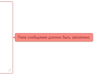
Informing with tooltips 
Convenient, but if the browser size is small, you need to show them from below or above, which will cover other fields.
In the case of empty fields, you can show by simply highlighting the fields when trying to submit the form 
. But if you need a message in the form: "Passwords do not match", then this will not work.
You can show sewn-in blocks with messages under each one or one universal one 
. Of the minuses: if from below or from above, then the form moves apart, if from the side, then it takes up space.
I would like to know how you do it yourself? Maybe there is an interesting article on this topic?
Answer the question
In order to leave comments, you need to log in
Usually highlighting the field border and plain text without borders at the bottom of the field.
Also, sometimes above the form itself in the block circled (for example, in red) with a border, the output of all incorrectly filled fields.
I have something like this.
If not specified by the designer, I show a message over the field a little higher (sometimes lower) and to the right, so that you can poke the mouse into the field. Once a field has focus, its message disappears.
I've been using jQuery.validationEngine
for a year now and I don't know grief. Doka is very simple. From spam bots, send the form with Ajax. You can send responses via json.
Oh yes, and most importantly, usability :) the demo speaks for itself.
Didn't find what you were looking for?
Ask your questionAsk a Question
731 491 924 answers to any question