Answer the question
In order to leave comments, you need to log in
How do you designate external links in a desktop application?
All the best!
We will have a table and a column with an action in our application: 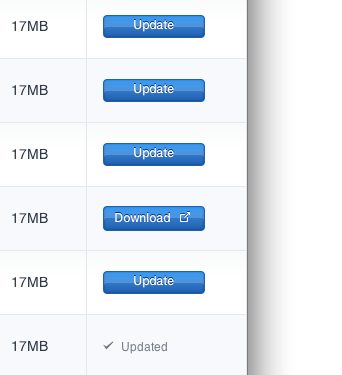
Either this is an action inside our application (“Update”), or open a link in the browser (“Download”, which stands for “Open Developer Site, Find Download Link And Download”).
Our team is divided. The picture reflects the opinion of ... that's right, the designer! The second opinion is to make them more like links .
.
The most interesting thing is this: I took the first two open programs ... and found both options in each!
Here is Firefox 18. With links in the About window, everything is clear, but here is a round lilac button in the background (the Preferences window) - also a link, opens a tab in the browser: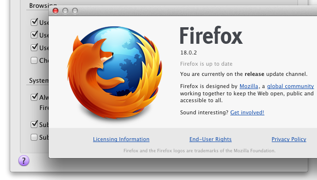
And here is my favorite JetBrains (favorite primarily for its UI approach): 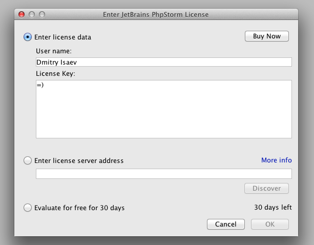
Here both external links ("Buy now" and "More Info") look logical, each in its place.
I would like to understand some rules: where which option will be appropriate?
Well and, in particular, in relation to our interface. This is a rather important part of the UI for us: active users click on these button links almost every day.
Answer the question
In order to leave comments, you need to log in
If we are talking about remote resources, then I would limit myself to links with intuitive icons, and leave buttons for dialog boxes, etc., where you need to emphasize the importance of choosing the next action from the user.
Links must be links and nothing else, otherwise it is misleading. Unfortunately I didn't find this purple button in Firefox, but if it opens something like opera:cofig it makes perfect sense as it opens something inside the application (which looks like a web page)
But if you take your design, specifically, if you insert a link instead of a single button, it will look so miserable that all the semantic usefulness of the links will simply fade. Therefore, either change the entire design of this block, or agree with the design approach to links.
Sorry, I made a mistake with the address, I began to write a comment in the text field without clicking "comment" (by the way, about usability).
The rule is simple: for operations inside the application - buttons, for links to other resources - underlined text. But this rule is from the general logic of application development, which in this case is secondary to the logic of a specific (your) application.
1. Underlining links is primarily a method of highlighting them in an array of text. If your application does not have such arrays, then this unties your hands.
2. You better know whether it is very important for the user to imagine in advance that by clicking “here”, he will be taken to a third-party site.
3. Ordinary users in such simple cases as this one learn quickly (literally from the first or second time) and remember the difference the next time they visit. It is your designer's responsibility to always estimate how quickly the user will learn the relationship between certain interface quirks and application control functions.
And, finally, it is impossible to say which is better, seeing only a small fragment of the screen. Perhaps the underlined text among the buttons will disfigure the appearance, or maybe not.
Your buttons are not dynamic, and a set of identical text buttons is usually easily replaced by small buttons with icons. In addition, this blue is very hard on the eyes. Move away from the monitor a couple of meters, squint and pay attention to how unobtrusive the lilac circle is ...
Didn't find what you were looking for?
Ask your questionAsk a Question
731 491 924 answers to any question