Answer the question
In order to leave comments, you need to log in
How do flexes work in bootstrap 4?
Greetings!
I decided to switch to 4 bootstrap. And as it should be when learning something new - I don't understand how flexbox works in it.
What is not clear:
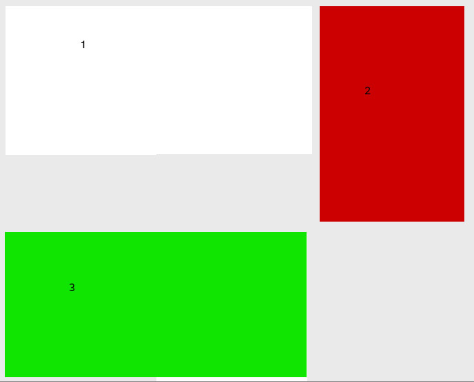
the parent - div.row already has flex-wrap:wrap and display:flex; respectively.
inside are div.col-8, div.col-4, div.col-8;
I imagined this moment like this: the last col-8 will automatically take place under the first col-8, well, like with floats and flex-wrap.
But that did not happen. And if everything is clear to me in the case of float, then with flexbox, given that the code [seems to be] correct, it is not entirely clear to me.
The height depends on the content or is manually set if it matters.
Thanks for the help!
Answer the question
In order to leave comments, you need to log in
Block 3 and on bootstrap 3 would not take place under 1. Same as on flex-wrap.
Only if you play with floats, but hemorrhoids.
In general, there are js libraries like Masonry for this,
or like this https://jsfiddle.net/40oujjct/
Something like this:
the flex row takes the height of the largest block in the row.
flex-wrap wraps a block that doesn't fit on a new row.
Flexes are ideal for situations where the height of the blocks inside the flex is the same. Although, in your case, you can play around - fix the height and set the direction of column . But this is not always justified
Didn't find what you were looking for?
Ask your questionAsk a Question
731 491 924 answers to any question