Answer the question
In order to leave comments, you need to log in
How can I nest one block within another so that the borders appear as equal?
Good morning.
Problem essence:
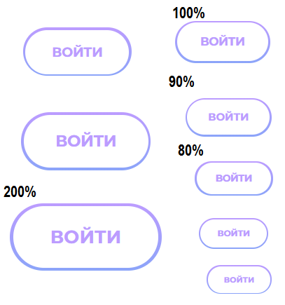
The sizes of borders at "button" are displaced at scaling (ctrl+ ctrl-). But this is not the saddest thing. It's sad that the top and bottom borders don't look the same at 100% scale.
The button is made elementary:
<button class="button-custom">
⠀⠀<span>ВОЙТИ</span>
</button>
.button-custom {
⠀⠀box-sizing: border-box;
⠀⠀width: 99px;
⠀⠀height: 44px;
⠀⠀border-radius: 22px;
⠀⠀padding: 2px;
⠀⠀// тут свойства шрифта, цвета фона, цвета текста и т.д.
⠀⠀& span {
⠀⠀⠀⠀display: table-cell;
⠀⠀⠀⠀text-align: center;
⠀⠀⠀⠀vertical-align: middle;
⠀⠀⠀⠀width: 95px;
⠀⠀⠀⠀height: 40px;
⠀⠀⠀⠀border-radius: 20px;
⠀⠀}
}
Answer the question
In order to leave comments, you need to log in
Didn't find what you were looking for?
Ask your questionAsk a Question
731 491 924 answers to any question