Answer the question
In order to leave comments, you need to log in
How can I extend the width of a block outside of the bootstrap grid without shifting the content in it?
Hello.
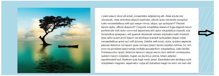
The botstrap grid layout has a section with an image and a text block. The image and text are strictly on the grid, but the block itself rests on the edge of the page.
So far I have done by cutting off the edge. The screenshot shows how I did it, and the shading shows how it should be. Can you please tell me the best way to implement this?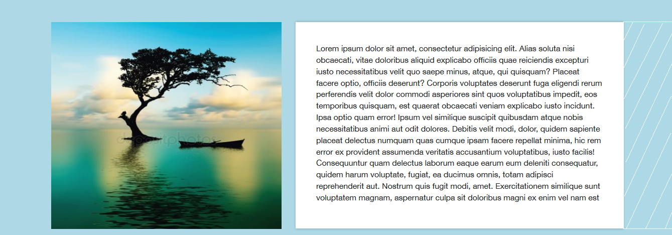
<section class="loremcontainer">
    <div class="container">
        <div class="row">
          <div class="col-xs-5">
            <img src="img/landscape.jpg" width="459" height="412" alt="lorem">
          </div>
          <div class="col-xs-7">
            <div class="loremcontainer-area">
              <p>Lorem ipsum dolor sit amet, consectetur adipisicing elit. Alias soluta nisi obcaecati, vitae doloribus aliquid explicabo officiis quae reiciendis excepturi iusto necessitatibus velit quo saepe minus, atque, qui quisquam? Placeat facere optio, officiis deserunt? Corporis voluptates deserunt fuga eligendi rerum perferendis velit dolor commodi asperiores sint quos voluptatibus impedit, eos temporibus quisquam, est quaerat obcaecati veniam explicabo iusto incidunt. Ipsa optio quam error! Ipsum vel similique suscipit quibusdam atque nobis necessitatibus animi aut odit dolores. Debitis velit modi, dolor, quidem sapiente placeat delectus numquam quas cumque ipsam facere repellat minima, hic rem error ex provident assumenda veritatis accusantium voluptatibus, iusto facilis! Consequuntur quam delectus laborum eaque earum eum deleniti consequatur, quidem harum voluptate, fugiat, ea ducimus omnis, totam adipisci reprehenderit aut. Nostrum quis fugit modi, amet. Exercitationem similique sunt voluptatem magnam, aspernatur culpa sit doloribus magni ex enim vel nam est </p>
            </div>
          </div>
        </div>
      </div>
  </section>
.loremcontainer {
background-color: lightblue;
}
.loremcontainer-area {
right: 5px;
background-color: white;
box-shadow: 0px 0px 4.5px 0.5px rgba(0, 0, 0, 0.2);
padding: 41px;
margin-bottom: 20px;
}
.loremcontainer-area p {
font-size: 16px;
}Answer the question
In order to leave comments, you need to log in
Set the block with the text to relative, visually stretch the block with a pseudo-element, the wrapper that you have is stretched to the full width overflow-x: hidden; and all focus
1. Instead of col-xs-5and col-xs-7you need col-xl-5and col-xl-7respectively 2. A crutch, but it works, you hang another class
on the block and on it:col-xl-7
.additional-class {
    max-width: none !important;
    margin-right: calc( (100vw - 100%)/2*-1 ) !important;
    flex-grow: 1;
}
Didn't find what you were looking for?
Ask your questionAsk a Question
731 491 924 answers to any question