Answer the question
In order to leave comments, you need to log in
How can a designer make an Android App Icon correctly?
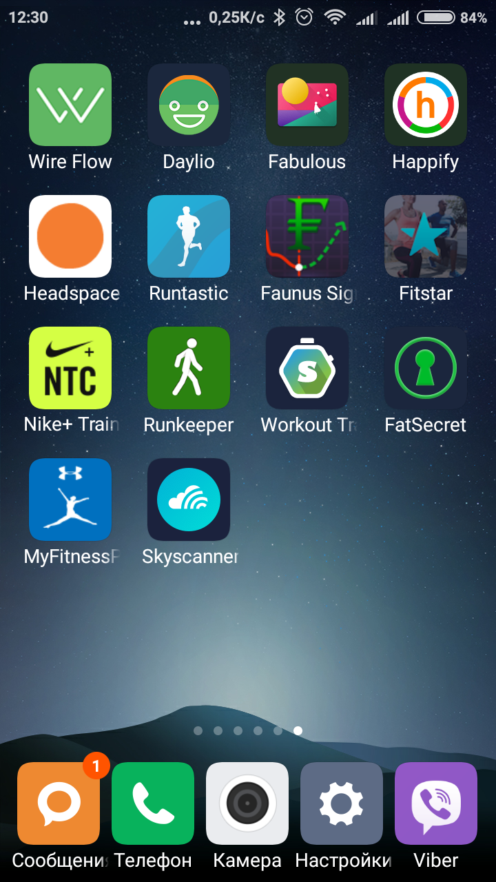
The bottom line is that some android application icons look “blurry”, while others are clear, as if they are vector.
How to properly make an icon so that it is absolutely “clear” on all screens. I make PNG ldpi, mdpi, hdpi, xhdpi, xxhdpi, xxxhdpi and 1024x1024 + 512x512 and give it to developers
. What is the essence of the difference in icons? Maybe the problem is not on the design side, but somewhere further?
Answer the question
In order to leave comments, you need to log in
You just need to export icons of all sizes from the vector, and not confuse them, otherwise Android will take what they have, stretch or compress to the desired size and it will turn out blurry, since PNG is already a raster.
Also, nothing prevents you from taking Apktool and opening applications with clear and fuzzy ones in the most elementary way, and comparing them. Or open Android Studio, create a project and check.
Unless, of course, you pretend to be a professional who cares about his customers, and not about the purity of his brain from unnecessary information and not to overwork.
Didn't find what you were looking for?
Ask your questionAsk a Question
731 491 924 answers to any question