Answer the question
In order to leave comments, you need to log in
Full page zoom?
There is a task to adapt the page to all devices without changing the layout, but only the scale. 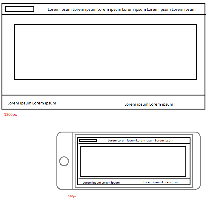
The site should only be displayed in landscape.
The argument that on the phone everything can be viewed under a magnifying glass is not an argument.
On the phone, the user will be able to scale everything himself.
The question is, how can this be implemented correctly , otherwise only scale comes to mind, but is this a bad option?
Maybe someone will advise.
Answer the question
In order to leave comments, you need to log in
1) It is impossible to lock the screen rotation for the web in the phone.
2) The aspect ratio of different phones is different. For example, Androids have: 4:3, 3:2, 5:3, 16:9, 16:10. This means that different phones will have different field sizes.
3) With desktop browsers, it's still sadder: the user can resize the window as he pleases.
It is better to give up this idea - it will only bring you pain and hemorrhoids, and the result will look and work disgusting.
Didn't find what you were looking for?
Ask your questionAsk a Question
731 491 924 answers to any question