Answer the question
In order to leave comments, you need to log in
Figma and typography?
How is it correct in the end?
Line height 30 pixels, font size 18 pixels. In Figma, setting the indentation as a percentage - 160% fonts goes beyond the line.
Here's an example: 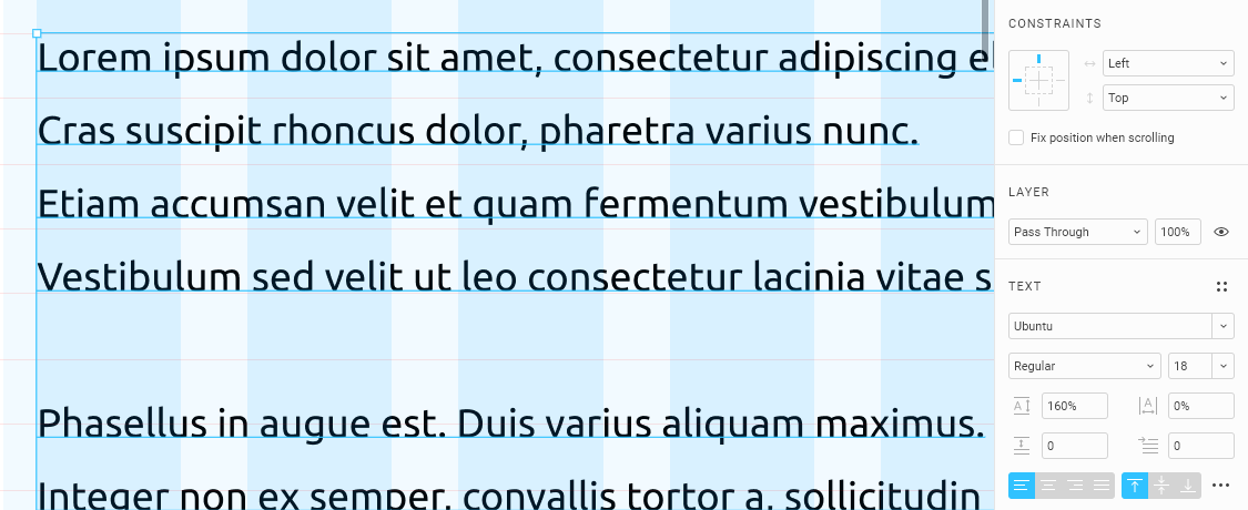
I read somewhere that the standard line size in a font is 120%, so I set it to 140% and more or less fall into the given rhythm. But because of top-alignment, the line starts higher.
Here is an example: 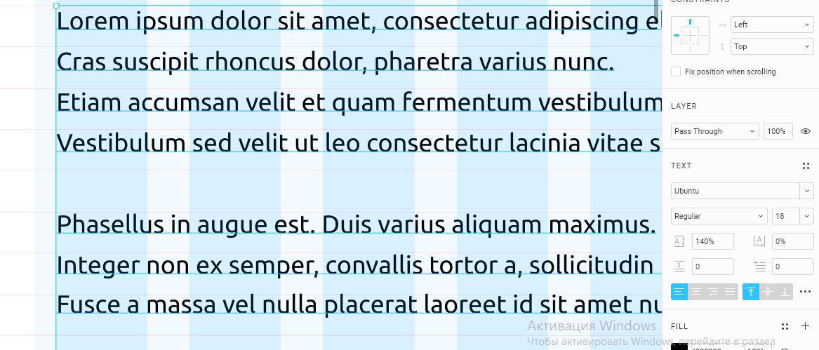
If you lower the line by a couple of pixels, then everything rises as it should. But, the method is clearly a crutch. Explain how to do it right?
Here's an example: 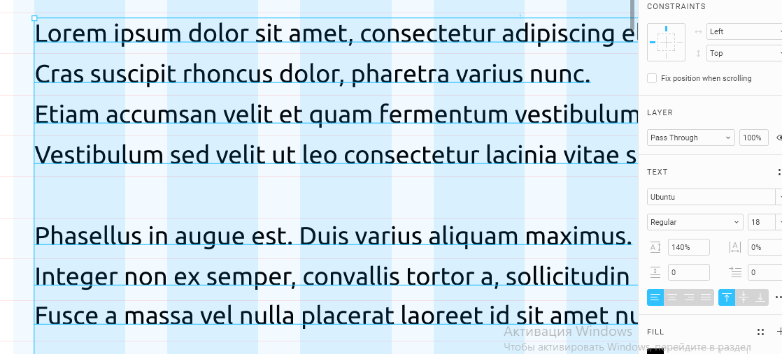
Another question - How many lines should a two-line header occupy? Is baseline binding required?
Here is an example: 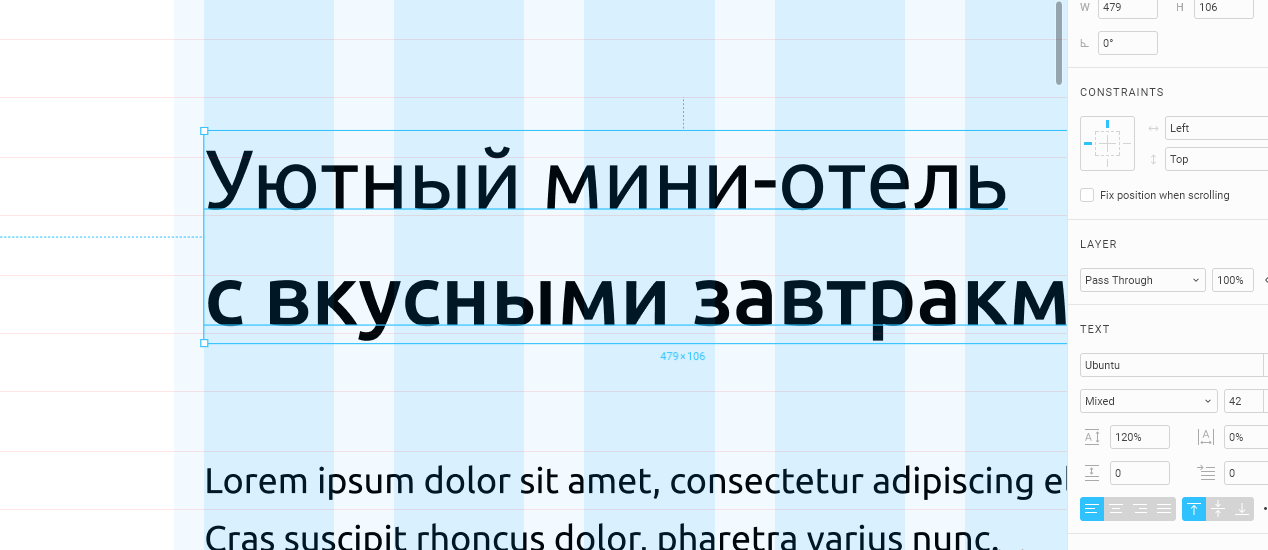
Well, and most importantly, how to be a typesetter in all this disgrace. It turns out he measures leading and indents by eye?
Answer the question
In order to leave comments, you need to log in
Unlike CSS, Figma considers the percentage line-height not from the size (font-size), but from the default line height, which is written inside the font. For example: if my font has a default line height of 120%, and in Figma I specify 140%, then in fact it will be 120*140=168% of font-size.
There is no standard for a default line-height. Usually it is 120-130%, but not always. There are quite a few exceptions, hence there will be a constant mess. The decision of the Figma developers is frankly strange and unsuccessful.
Solution: forget about percentages, specify line-height only in pixels (it’s in Figma, it’s a separate discussion about CSS).
In my opinion, it is much easier, like once in a million, to specify the line spacing in pixels, not percentages. So you enter in the field: 40 px for example. And adjust the horizontal rulers, and then move the textbox so that the baseline rests on the ruler (not forgetting the correct leading, a multiple of the size of the rulers). And that's it. There are no problems at all.
First, make the font a multiple of the grid. Grid 8px, font 16/24/32/36 etc.
Then adjust by eye), the fonts are different and are displayed differently in the editor and browser ALWAYS (Although the figma renders in canvas). Customize the layout designer. UPD: or see the CODE tab in Figma. Thanks ludr
Compare. The same font in Figma and the browser.
1) Figma grid setup
2) Figma headline
3) Figma paragraph
4) Figma Browser settings
5) Browser adjusted line-height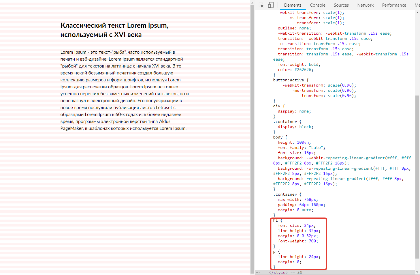
Figma and typography? - Where is the question?
How is it correct in the end? - Based on what to sum up? Before this "question" only the first "question".
Asking the right question: “How to ask the right questions?”
Your typography is seriously lame. The conclusions and questions that you are trying to make and ask based on incorrect basic knowledge are absurd, it's not about Figma. Tighten the typography and questions to Figma in this aspect will disappear.
The layout designer in Figma needs to go to the Code tab.
Do not think that Mikalai Bulava answered your "questions". He just has a mess like yours in his head.
There is a solution for the layout designer, but the figma here of course remains on the side) In the figma, set the line-height in pixels. And the layout designer also needs to import the layout into Avocode, in which it has long been possible to set dimensionless units for line-height. Everything will be recalculated automatically from the values specified in pixels and will work exactly as the layout designer expects. But it is worth considering that svg icons that were converted from something there or crookedly stuck together, well up. Also, some font files will have to be filled in with pens, but this is once for the entire project ctrl + c / ctrl + v
Didn't find what you were looking for?
Ask your questionAsk a Question
731 491 924 answers to any question