Answer the question
In order to leave comments, you need to log in
Evaluate the site from a marketing and usability point of view?
Hey!
Please rate the site. The task is to get the visitor to click on the try button and fill out the form.
What are the disadvantages? What can be improved? How is the site perceived from the user's point of view?
Link to medods.ru
Answer the question
In order to leave comments, you need to log in
1. Above the phrase "return the money" I would add a large and noticeable "try" button, because I saw the interface, looked down and bam, there is no "try" button. I had to scroll up and there I saw her. This is very bad.
2. I would make the bottom (green) "try" button much larger to catch the eye.
this. As you can see, on my laptop screen (1366 x 768) when fully viewing the interface of your system, the top button becomes invisible.
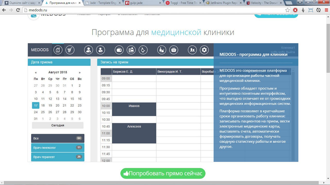
The "Try" button does not carry any information, the name of the button and the icon only confuse. Write what you offer to your customers. The action buttons are: Buy, Get Now, Register, Order, etc. But the vague buttons like More or Try do not give an understanding of what will happen to me if I click on the button.
Get rid of horizontal scrolling, this is the first sign of poor-quality layout. Three letters inscribed in a circle are not readable with the text, confusion is obtained.
notes
take.ms/eer7p
take.ms/nkMh8
take.ms/8L3jr I
don't want to register. do you have a demo username/password?
Didn't find what you were looking for?
Ask your questionAsk a Question
731 491 924 answers to any question