Answer the question
In order to leave comments, you need to log in
Do I understand the logic of the layout on the bootstrap correctly?
Hello!
I'm learning Bootstrap. I used to make websites with divs on a grid from 960gs (without using their framework). Now I'm drawing a new design, I want to develop it on Bootstrap in the future.
A few questions:
1. Standard grid, 12 columns, 60 px column width): 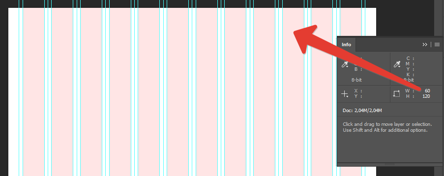
2. Left and right margins of 10 px: 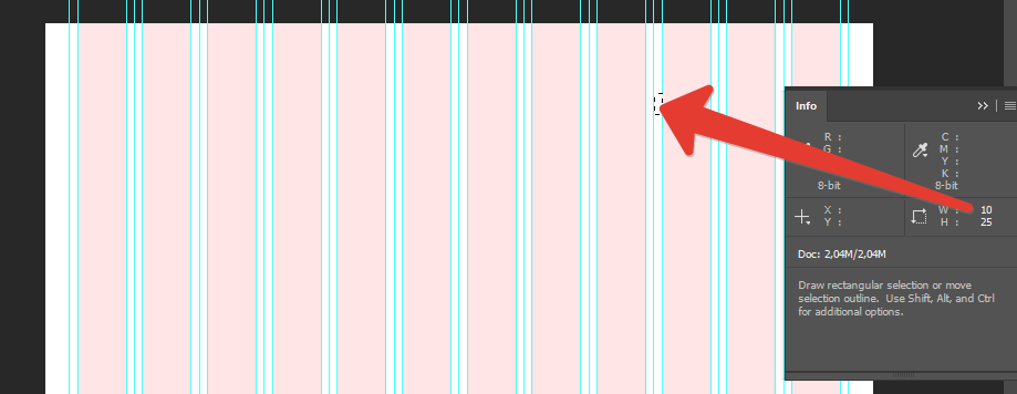
3. In bootstrap customization ( bootstrap-3.ru/customize.php#grid-system) found only @ grid-gutter-width (padding between columns, returns halved left and right). It turns out that in the case of my grid, I need to set the value to 20px, right? The column width for each screen resolution is different ( bootstrap-3.ru/css.php#grid-options), how to deal with this question when drawing the layout? What value to set?
4. In the future, it is necessary to draw the design according to the following system: 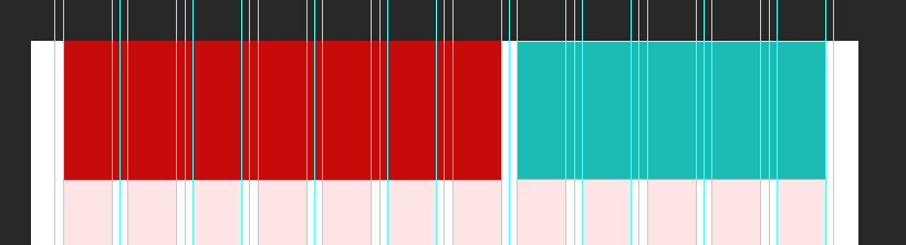
Place content inside the blocks (marked in color), right?
5. After such correct drawing of the elements, it remains to play with the bootstrap classes so that on various devices these blocks "fold" correctly (on a smartphone, all blocks are in 1 column, on a tablet more), right? For now it turns out such a situation that I need to leave 2 blocks in a row on the tablet, and he transfers them to different lines, leaving a lot of space on the right side of the screen.
6. There is no fundamental difference what width of the layout to set? All my life I have been drawing with a maximum width of 960px
.wrapper{
width: 960px;
position: relative;
margin: 0 auto;
}Answer the question
In order to leave comments, you need to log in
3. Yes, that's right.
4. 5. for the tablet you need the prefix col-md-
Immediately in the div write: class="col-md-4 col-lg-3" and so
on already .col-sm-
6. Nothing at all, just specify the maximum allowable width for the container class and that's it
PS: Everything goes from smaller to larger.
If you need the same column proportions on both desktop and tablet,
put only col-md-6 on desktop, it will be "inherited" for all higher resolutions...
Didn't find what you were looking for?
Ask your questionAsk a Question
731 491 924 answers to any question