Answer the question
In order to leave comments, you need to log in
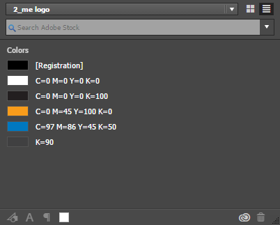
Do colors in logos have to be whole or are fractional values of colors after a decimal point acceptable?
Answer the question
In order to leave comments, you need to log in
Whole. Percentage values were originally created for the convenience of printers. That is, to be without fractions) Fractions in most cases will not lead to anything terrible, but as Pavel Designer noted , there are technologies that are very sensitive to ink values - in flexo dot gain can reach monstrous values (40-60-80%) , this means that the lightest 1% fill can become very dark.
In a chandelier, this must be especially carefully monitored. An unpleasant glitch is known behind the chandelier: showing a fill of 0%, in fact, a fill with a small shot is set (such as 0.01342534%) - and this small shot will be imprinted and spread with dirt. Therefore, it is better to manually fill in all the zeros and, in general, lick every pixel and curve with your tongue when the layout is made for such sensitive technologies. In rotogravure, small fractions can also be decisive and determine whether the color will fail or not.
Yes, prepress is best avoided)
Better without when printing (especially flexo) there can be trouble due to decimal places. There have been cases when a color has a value of 35.5142536537373, but is shown in Illustrator as 35.50 and you don't even know about it until you see jambs on the finished package, for example.
Didn't find what you were looking for?
Ask your questionAsk a Question
731 491 924 answers to any question