Answer the question
In order to leave comments, you need to log in
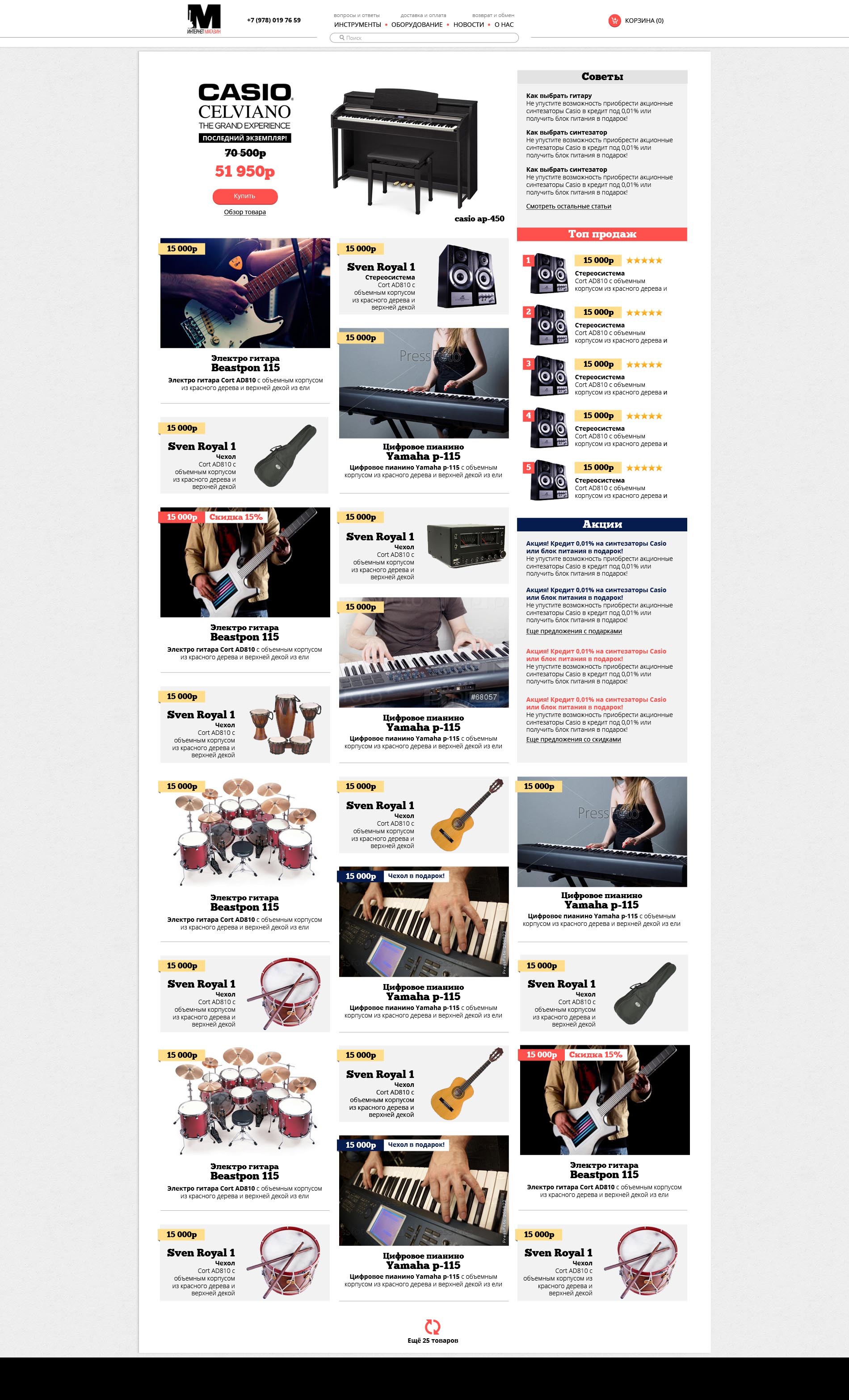
Criticize the concept. What to change in the layout?

Answer the question
In order to leave comments, you need to log in
I always looked for "categories of tools" and targeting by model, price, and characteristics on such sites.
As a keyboardist, I'm not interested in suggestions for guitars at all, for example.
Therefore, it is necessary to somehow pay more attention to the categories. The principle of buying from the main page will not work in this way, as it seems to me.
The "Tips" block visually merged with the "Top Sellers" block heading.
If you mentally remove "Tips", then "Top Sellers" has moved off the horizontal grid relative to the rest of the columns, it is better to move it slightly down.
General: you can remove the horizontal rulers between the blocks, if you make the layout more spacious, add space between the columns (shift, at least), and the captions for the images will be a little closer to the images themselves (for blocks on a white background)
In general, if there is no sacred need to make a website to the width of the monitor - it is better to make it to the width. Sensation as if looking through a narrow vertical window. It won't rush when paging, but think about it anyway.
Black bar at the bottom - basement?
If in general terms, then your work simply does not breathe, does not function. Color solutions are very controversial. Try to perceive this kind of work as a program. Now it looks more like a spread of a magazine.
Can divide products into zones, or categories of 5-6 pieces, sign them and make more empty space between them?
Didn't find what you were looking for?
Ask your questionAsk a Question
731 491 924 answers to any question