Answer the question
In order to leave comments, you need to log in
Bootstrap catalog menu optimization?
Good afternoon, there is a site made up on bootstrap. 
This is what the catalog menu looks like on the desktop.
In mobile 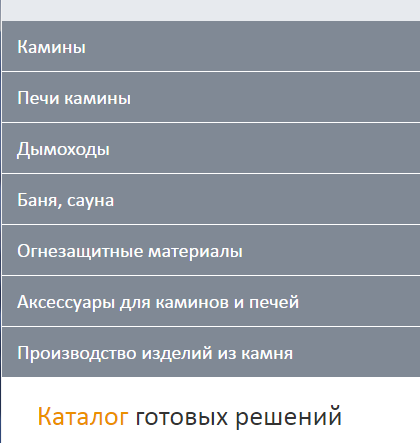
The essence of the issue: when you go through the categories, they unfold and, accordingly, once you get to another page, you find yourself at the very top. That is, you have to scroll through all the categories on your phone to get to the content area of each category. What solution will be optimal for this situation, so that the user is comfortable.
Answer the question
In order to leave comments, you need to log in
For mobile screens, you can make, by default, a smooth scroll to the content area. For example,
if ($(window).width() < 768) {
     $("#content").animate({scrollTop: 10}, 1000);
}Didn't find what you were looking for?
Ask your questionAsk a Question
731 491 924 answers to any question