Answer the question
In order to leave comments, you need to log in
Why, when changing the proportions of the window in height, the vest is not adaptive?
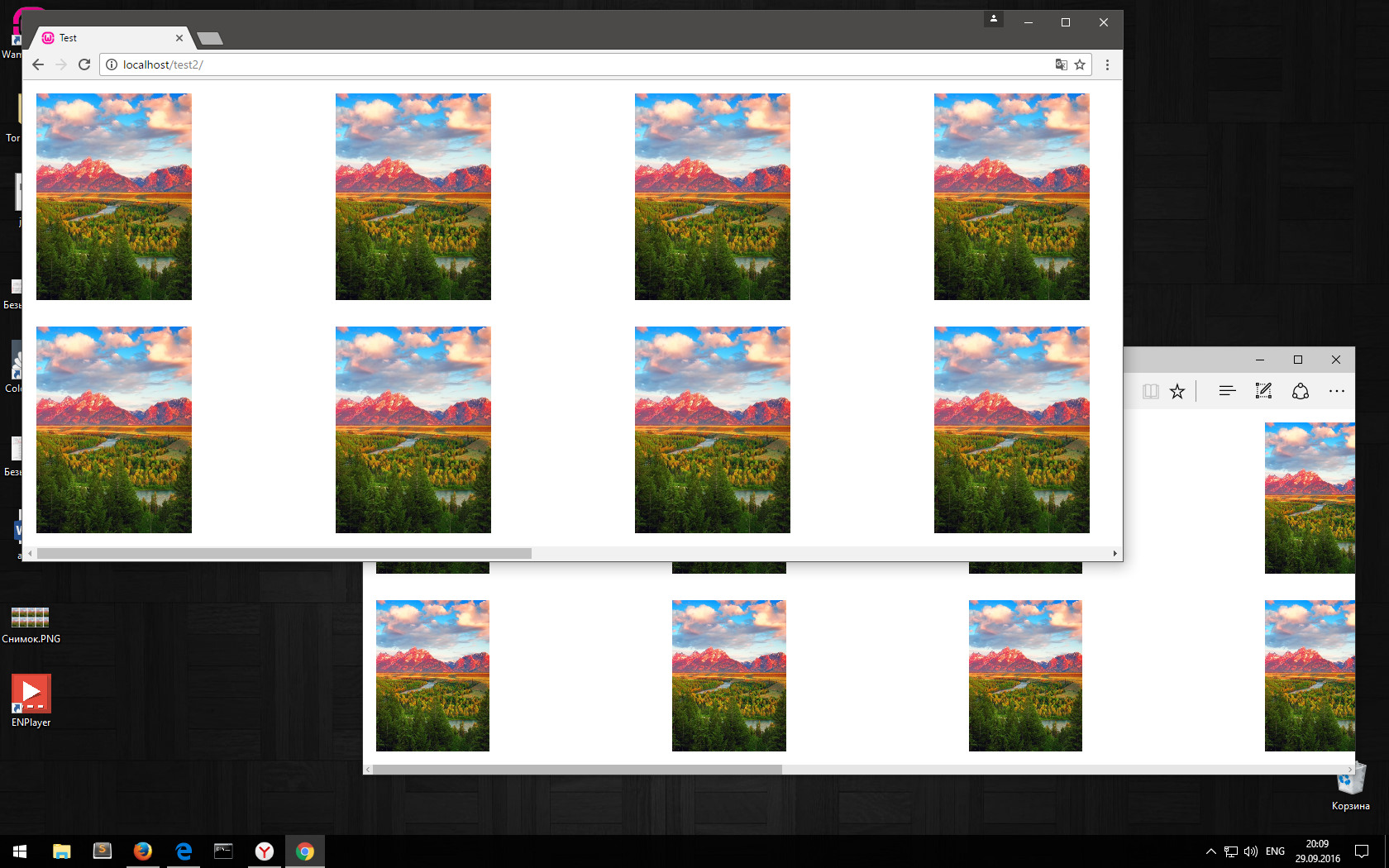
I have n images, fixed resolution, and they need to be set exactly as in the example, rubber:
(scrolling is done horizontally)
When you open the page, everything is located correctly, in the right proportions and at the right intervals. But when the browser is resized, the column width remains fixed. Well, this happens in all browsers except Firefox.
Once again:
When I open everything is fine, I resize the browser - everything is bad: I 
update now at this scale, everything is restored: 
Code:
codepen.io/Mois-ilya/pen/amyWQr
(an empty picture is loaded so that there is no void, until the pictures all loaded)
Answer the question
In order to leave comments, you need to log in
this is a browser bug)) I saw somewhere a solution with crutches, but I don’t remember where .... google
flexbox resize image width something like this
Didn't find what you were looking for?
Ask your questionAsk a Question
731 491 924 answers to any question