Answer the question
In order to leave comments, you need to log in
Why isn't the media query working?
I can't figure out why the request is not working.
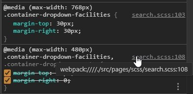
Found that if there is a request for Tablet before the request for mobile, it does not work, for example, this code does not work
&-dropdown-facilities {
    margin-top: 30px;
    @media all and (max-width: $smDesktopWidth) {
      order: 3;
      margin-top: 0;
    }

    @media all and (max-width: $tableWidth) {
      margin-top: 30px;
      margin-right: 30px;
    }

    @media all and (max-width: $phoneWidth) {
      margin-top: 20px;
      margin-right: 0;
    }
}&-dropdown-guests {
margin-top: 21px;
@media all and (max-width: $smDesktopWidth) {
order: 2;
margin-top: 0;
margin-right: 30px;
}
@media all and (max-width: $phoneWidth) {
margin-top: 20px;
margin-right: 0;
}
}
Answer the question
In order to leave comments, you need to log in
Set the min-width condition for tablet
@media all and (min-width: $phoneWidth) and (max-width: $tableWidth) {
      margin-top: 30px;
      margin-right: 30px;
}You have something with the assembly of styles, I'm almost sure that in the final css file the rules for mobile are higher than for tablets
Didn't find what you were looking for?
Ask your questionAsk a Question
731 491 924 answers to any question