Answer the question
In order to leave comments, you need to log in
Why is the UIkit grid messed up when viewing on a phone?
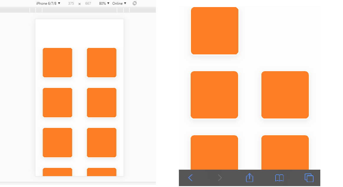
There is such a code . In developer mode on mobile devices everything looks fine. But when you open the same page, but already from the phone (namely, from iPhones 8 and 10), the grid goes astray - the second element (which should be in the first row, in the second column) moves down to the second row in the first column, and the entire grid warps . Like this:

Tell me, please, what could be the matter? I tried to change the size of the elements, padding, but nothing worked.
Answer the question
In order to leave comments, you need to log in
Didn't find what you were looking for?
Ask your questionAsk a Question
731 491 924 answers to any question