Answer the question
In order to leave comments, you need to log in
Why doesn't responsiveness work on specific devices?
Adaptively layout the site on localhost, when checking, I noticed a trick: the media query works at an arbitrary size without specifying the device: 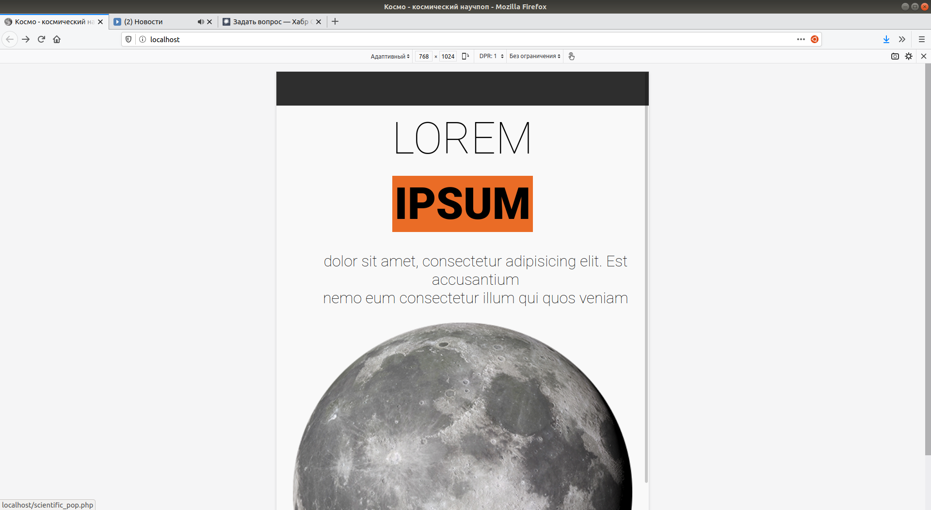
But at the same time, if you specify an Ipad as the device, which has the same dimensions, the desired picture disappears abruptly : 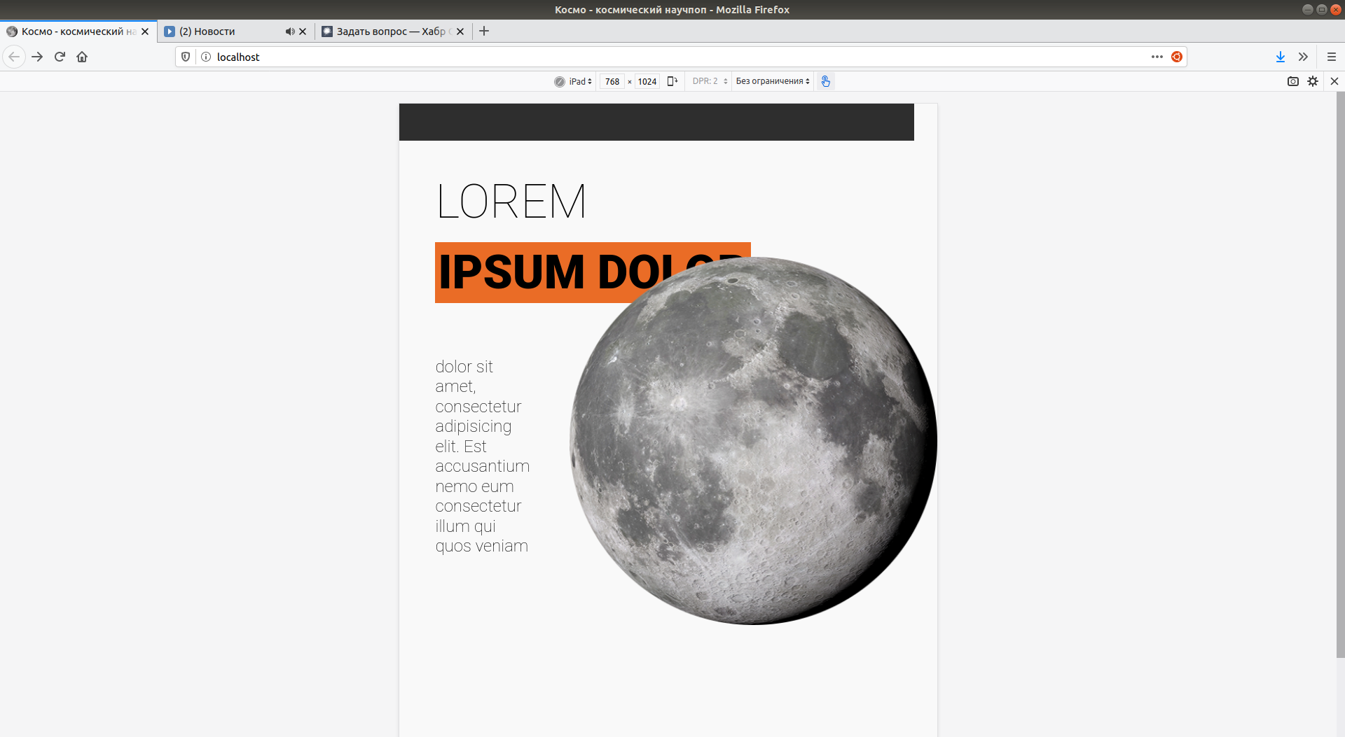
The media query itself looks like this :
@media (max-width: 770px) {
        .main-box {
                display: block;
                text-align: center;
        }

        .index-moon {
                margin: 0;
        }

        .description {
                display: block;
        }

        h1 {
                text-align: center;
                margin: 0;
        }
}Answer the question
In order to leave comments, you need to log in
Didn't find what you were looking for?
Ask your questionAsk a Question
731 491 924 answers to any question