Answer the question
In order to leave comments, you need to log in
Why doesn't layout match real devices?
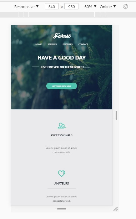
I did the layout in Chrome using the developer tools. For media queries, I set the required resolution and the responsive checkbox in the developer panel and watched the result. For all popular resolutions, the layout looks good, I checked the layout on Chrome, Opera, Mozilla Firefox, Yandex browser, Internet Explorer. I also changed the width of the window on all these browsers and the layout still looks good and there are no horizontal scrolls.
BUT! when I open the site on my smartphone Dooggee titans 2(540x960) Android 4 layout floats, it also floats on such resources as iloveadaptive.com
What is the reason for this behavior? why does the result not converge?
could this be the reason?


Answer the question
In order to leave comments, you need to log in
You have configured the developer panel incorrectly. Mobile phones have more physical pixels than browser "css pixels". The difference is expressed by the Device Pixel Ratio (DPR) parameter - this is the multiplication factor, how many physical pixels are in one "css-pixel".
take.ms/v1Ms8
In Responsive mode, Chrome has DPR=1.0 by default (Macbook has 2.0 by default because it has a retina screen). You set the viewport width to 540px, but your phone most likely has DPR = 1.5 and the resolution in the browser is 360px (540 / 1.5 = 360).
You need to enable DPR display and refine the layout on small screens from 540px to 320px.
Pavel Radkov , hmm, I wonder how to find out this DPR of your smartphone?
Because the CSS pixel is not always the same as the real one. You can see the size of your viewport at viewportsizes.com/mine
Here is the faucet size chart . In fact, when building an interface, the expected size does not always match the actual size. Scaling is often used. For example, in iphone 6, instead of physical 750 pixels, when building a site, scaling is used twice - the site is displayed in 375px mode in width. And for iphone 5, you need to adapt the site to 320px
Didn't find what you were looking for?
Ask your questionAsk a Question
731 491 924 answers to any question