Answer the question
In order to leave comments, you need to log in
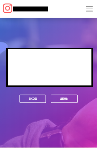
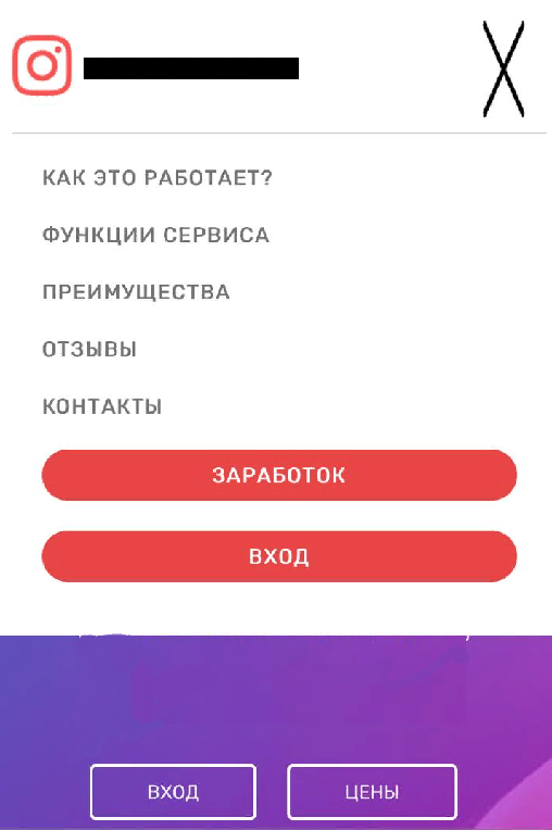
Why does the site display crookedly on the iPhone?
The site on android looks fine:
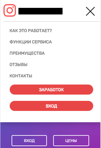
But on the iPhone it looks crooked:

HTML headers:
<header>
  <a href='/' class="logo">
    <div><img src="/static/instagram.png"></div>
    <div>DOMEN.RU</div>
  </a>
  <div class="open-menu" style="align-self: center;">
    <img id="open-menu" src="/static/open-menu.svg" style="cursor: pointer;">
  </div>
  <div class="nav none_menu">
    <a class="menu" onclick="slowScroll('#plan')">Как это работает?</a>
    <a class="menu" onclick="slowScroll('#function')">Функции сервиса</a>
    <a class="menu" onclick="slowScroll('#gestures')">Преимущества</a>
    <a class="menu" onclick="slowScroll('#quote')">Отзывы</a>
    <a class="menu" onclick="slowScroll('#footer')">Контакты</a>
    <a class="menu-login" href="/index_paying/">Заработок</a>
    <a href="/login/" id="login_href" class="menu-login">Вход</a>
  </div>
</header>header{
position: fixed;
z-index: 999;
left: 0;
top: 0;
width: 80%;
padding: 15px 10%;
display: flex;
justify-content: space-between;
border-bottom: 1px solid #fffdfd8f;
color: black;
background: white;
transition: 0.3s;
}
.fixed{
box-shadow: 0px 1px 25px rgba(2,3,3,.3);
}
.logo{
display: flex;
font-family: 'Sen', sans-serif;
font-size: 1.1em;
color: #555;
transition: 0.2s;
}
.logo:hover{
color: #e43232;
}
.logo div{
align-self: center;
padding-right: 10px;
}
.logo img{
width: 40px;
}
.nav{
display: flex;
align-self: center;
}
.nav a{
cursor: pointer;
position: relative;
align-self: center;
margin: 0px 10px;
text-transform: uppercase;
font-size: 0.85em;
font-weight: 600;
}
.menu{
color: #757373;
transition: 0.2s;
white-space: nowrap;
}
.menu:after{
content: '';
position: absolute;
opacity: 0;
bottom: -15px;
left: 0;
width: 100%;
height: 2px;
background: #757373;
transition: 0.2s;
}
.menu:hover{
color: black;
}
.menu:hover:after{
content: '';
position: absolute;
opacity: 1;
bottom: -5px;
left: 0;
width: 100%;
height: 2px;
background: black;
}
.menu-login{
background: #e84646;
padding: 7px 15px;
border-radius: 24px;
color: white;
font-weight: 600;
border: 1px solid transparent;
transition: 0.3s;
}
.menu-login:hover{
background: #e43232;
box-shadow: 0 1px 30px -3px rgba(0,0,0,.5);
}
.open-menu{
display: none;
}
@media screen and (max-width: 830px) {
header{
flex-wrap: wrap;
}
.nav{
width: 100%;
flex-flow: column;
border-top: 1px solid #c7c7c7;
padding: 10px;
margin-top: 10px;
}
.menu-login{
text-align: center;
}
.nav a {
align-self: auto !important;
margin: 10px !important;
}
.open-menu{
display: flex !important;
}
#open-menu{
width: 28px;
padding-right: 15px;
}
.none_menu{
display: none !important;
}
}Answer the question
In order to leave comments, you need to log in
Didn't find what you were looking for?
Ask your questionAsk a Question
731 491 924 answers to any question