Answer the question
In order to leave comments, you need to log in
Why does the google chrome developer panel display the responsive responsive incorrectly?
Can you please tell me why the developer panel does not place the elements (body for example) on the entire width of the window when I narrow the window to adjust the adaptive? The width of the body changes every time, although it is not even written in the styles, it should be the entire width of the window, in theory. Because of this, it is simply impossible to configure the adaptive. What do you advise? Maybe there are other developer panels that work better or do I still have problems in the code?
Uploaded the page to the hosting: https://damruss.github.io/exp1/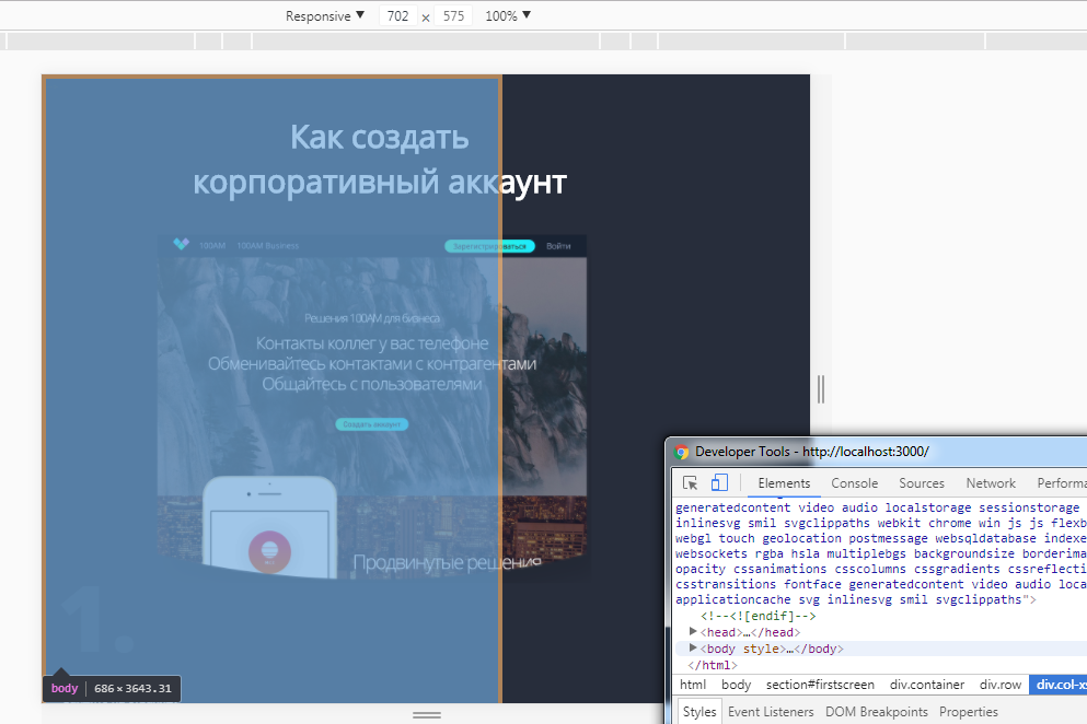
<body>
    <section id="firstscreen">
        <div class="container">
             <div class="row">
                  <div class="col-xs-12 firstscreen">
                     <h1>Как создать корпоративный аккаунт</h1>
                 </div>
            </div>
            <div class="row">
                <div class="col-md-6 col-xs-12 firstscreen_col1">
                    <img class="firstscreen_col1_bgmobile" src="img/В работе/решения.png" alt="Решения 100АМ"><br>
                    <div class="firstscreen_col1_part1">
                        <span>1.</span>
                        <p>Зайдите на страницу</p>
                        <a href="linkhttps://www.100am.co/business/">https://www.100am.co/business/
                        <img class="firstscreen_col1_img_icon" src="img/В работе/link_icon.png" alt="Иконка ссылки"></a>
                        <p>и нажмите</p>
                        <button class="firstscreen_col1_btn1"><div class="firstscreen_col1_btn1_title">Создать аккаунт
                        </div></button>
                        <div class="firstscreen_col1_text_ili">или</div>
                        <button class="firstscreen_col1_btn2"><div class="firstscreen_col1_btn2_title">Зарегистрироваться
                        </div></button>
                        <img class="firstscreen_col1_lines" src="img/В работе/col1_lines.png" alt="Линии">
                        <img class="firstscreen_col1_lines_point" src="img/В работе/col1_lines_point.png" alt="Указатель">
                    </div> <!-- column 1 part 1 -->
                    <div class="firstscreen_col1_part2">
                        <span class="firstscreen_col1_span_2">2.</span>
                        <p class="firstscreen_col1_part2_header">Введите название компании</p>
                        <p class="firstscreen_col1_part2_text">(Используется как название группы, название компании в карточках участников можно изменить)</p>
                        <img class="firstscreen_col1_team" src="img/В работе/new_team.png" alt="Create new team">
                    </div> <!-- column 1 part 2 -->
                </div>
                <div class="col-md-6 col-xs-12 firstscreen_col2">
                    <div class="firstscreen_col2_part1">
                          <img class="firstscreen_col2_part1_bg" src="img/В работе/решения.png" alt="Решения 100АМ">
                          <span>3.</span>
                          <p class="firstscreen_col2_part1_header">Введите почту, на которую будет зарегистрирован аккаунт</p>
                          <p class="firstscreen_col2_part1_text">(На эту почту не должен быть зарегистрирован личный аккаунт)</p>
                          <img class="firstscreen_col2_part1_team" src="img/В работе/col2_email.png" alt="Enter email">
                    </div> <!-- column 2 part 1 -->
                    <div class="firstscreen_col2_part2">

                    </div> <!-- column 2 part 2 -->
                </div>
            </div>
        </div>
    </section>
  </body>
</html>@media (min-width: 481px) and (max-width: 768px) {
#firstscreen {
margin: 0px;
}
.firstscreen {
padding-bottom: 0%;
h1 {
.opn-reg;
color: white;
font-size: 48px;
text-align: center;
position: relative;
left: -275px;
margin-left: 50%;
width: 570px;
}
&_col1 {
position: relative;
top: -40px;
span {
font-family: 'Open Sans', sans-serif;
font-weight: 800;
color: #333a49;
font-size: 140px;
}
a {
display: inline-block;
width: 330px;
height: 47px;
text-align: center;
-webkit-border-radius: 10px;
-moz-border-radius: 10px;
-ms-border-radius: 10px;
-o-border-radius: 10px;
border-radius: 10px;
background-color: #1b232f;
padding-top: 1.5%;
text-decoration: underline;
font-size: 18px;
}
&_part1 {
p {
margin: 14px 0px 14px 9px;
font-size: 18px;
color: white;
}
}
&_part2 {
position: relative;
top: -360px;
&_header {
.opn-reg;
font-size: 23px;
top: 399px;
width: 400px;
color: white;
}
&_text {
.opn-reg;
font-size: 16px;
top: 440px;
width: 450px;
text-align: left;
color: @base_dtext;
}
}
&_img {
&_icon {
height: 17px;
width: 17px;
margin-left: 5px;
}
}
&_span {
&_2 {
position: relative;
top: 20px;
}
}
&_bgmobile {
height: 536px;
width: 664px;
margin-left: 50%;
position: relative;
left: -332px;
top: 50px;
}
&_btn1 {
height: 47px;
width: 158px;
-webkit-border-radius: 40px;
-moz-border-radius: 40px;
-ms-border-radius: 40px;
-o-border-radius: 40px;
border-radius: 40px;
background: linear-gradient(to right, #1be9fd 0%, #3bffb7 100%);
border: 0px;
font-size: 16px;
&_title {
color: black;
.opn-bold
}
}
&_text_ili {
display: inline;
font-size: 18px;
}
&_btn2 {
height: 47px;
width: 195px;
-webkit-border-radius: 40px;
-moz-border-radius: 40px;
-ms-border-radius: 40px;
-o-border-radius: 40px;
border-radius: 40px;
background: linear-gradient(to right, #1be9fd 0%, #3bffb7 100%);
border: 0px;
font-size: 16px;
&_title {
color: black;
.opn-bold
}
}
&_lines {
height: 511px;
width: 240px;
margin: 20px 0px 0px 80px;
display: block;
&_point {
margin: 500px 0px 0px -179px;
}
}
&_team {
position: relative;
height: 187px;
width: 354px;
left: 0px;
top: 35px;
}
} // col1
&_col2 {
span {
position: relative;
top: 106px;
font-family: 'Open Sans', sans-serif;
font-weight: 800;
color: #333a49;
font-size: 114px;
}
&_part1 {
&_bg {
position: relative;
width: 514px;
height: 459px;
top: 30px;
}
&_header {
.opn-reg;
font-size: 23px;
top: 87px;
width: 564px;
color: white;
display: inline-block;
position: relative;
}
&_text {
.opn-reg;
font-size: 16px;
top: 70px;
width: 508px;
text-align: left;
color: @base_dtext;
display: inline-block;
position: relative;
}
&_team {
height: 262px;
width: 355px;
top: 104px;
position: relative;
display: block;
}
} // part1
} // col2
} // firstscreen
}Answer the question
In order to leave comments, you need to log in
This code solves your problem without changing the layout:
And don't use the min-width: 992px property; in body
html, body {
width: 100%;
height: 100%;
display:table;
}
Didn't find what you were looking for?
Ask your questionAsk a Question
731 491 924 answers to any question