Answer the question
In order to leave comments, you need to log in
Why does the bootstrap button remain regardless of screen width?
I'm trying to get into bootstrap, but there is a problem the menu button on the navbar does not want to disappear when the screen is larger than 768px, although judging by the documentation it should.
For example, I take the code from the official website of bootstrap and upload it to my LAN. Code from
here This is the content of the index.php file
<!DOCTYPE html>
<html lang="en">
<head>
  <meta charset="UTF-8">
  <title>ReFree</title>
  <meta name="viewport" content="width=device-width, initial-scale=1, maximum-scale=1">
  <script src="https://code.jquery.com/jquery-3.2.1.slim.min.js" integrity="sha384-KJ3o2DKtIkvYIK3UENzmM7KCkRr/rE9/Qpg6aAZGJwFDMVNA/GpGFF93hXpG5KkN" crossorigin="anonymous"></script>
  <script src="https://cdnjs.cloudflare.com/ajax/libs/popper.js/1.11.0/umd/popper.min.js" integrity="sha384-b/U6ypiBEHpOf/4+1nzFpr53nxSS+GLCkfwBdFNTxtclqqenISfwAzpKaMNFNmj4" crossorigin="anonymous"></script>
  <link rel="stylesheet" href="https://maxcdn.bootstrapcdn.com/bootstrap/4.0.0-beta/css/bootstrap.min.css" integrity="sha384-/Y6pD6FV/Vv2HJnA6t+vslU6fwYXjCFtcEpHbNJ0lyAFsXTsjBbfaDjzALeQsN6M" crossorigin="anonymous">
  <script src="https://maxcdn.bootstrapcdn.com/bootstrap/4.0.0-beta/js/bootstrap.min.js" integrity="sha384-h0AbiXch4ZDo7tp9hKZ4TsHbi047NrKGLO3SEJAg45jXxnGIfYzk4Si90RDIqNm1" crossorigin="anonymous"></script>
  <script src="assets/js/script.js"></script>
  <link rel="stylesheet" href="assets/css/style.css">
  <link rel="stylesheet" href="https://cdnjs.cloudflare.com/ajax/libs/animate.css/3.5.2/animate.css" />
</head>
<body class="home">
  <nav class="navbar navbar-toggleable-md navbar-light bg-faded">
  <button class="navbar-toggler navbar-toggler-right" type="button" data-toggle="collapse" data-target="#navbarSupportedContent" aria-controls="navbarSupportedContent" aria-expanded="false" aria-label="Toggle navigation">
    <span class="navbar-toggler-icon"></span>
  </button>
  <a class="navbar-brand" href="#">Navbar</a>

  <div class="collapse navbar-collapse" id="navbarSupportedContent">
    <ul class="navbar-nav mr-auto">
      <li class="nav-item active">
        <a class="nav-link" href="#">Home <span class="sr-only">(current)</span></a>
      </li>
      <li class="nav-item">
        <a class="nav-link" href="#">Link</a>
      </li>
      <li class="nav-item">
        <a class="nav-link disabled" href="#">Disabled</a>
      </li>
    </ul>
    <form class="form-inline my-2 my-lg-0">
      <input class="form-control mr-sm-2" type="text" placeholder="Search">
      <button class="btn btn-outline-success my-2 my-sm-0" type="submit">Search</button>
    </form>
  </div>
</nav>
</body>
</html>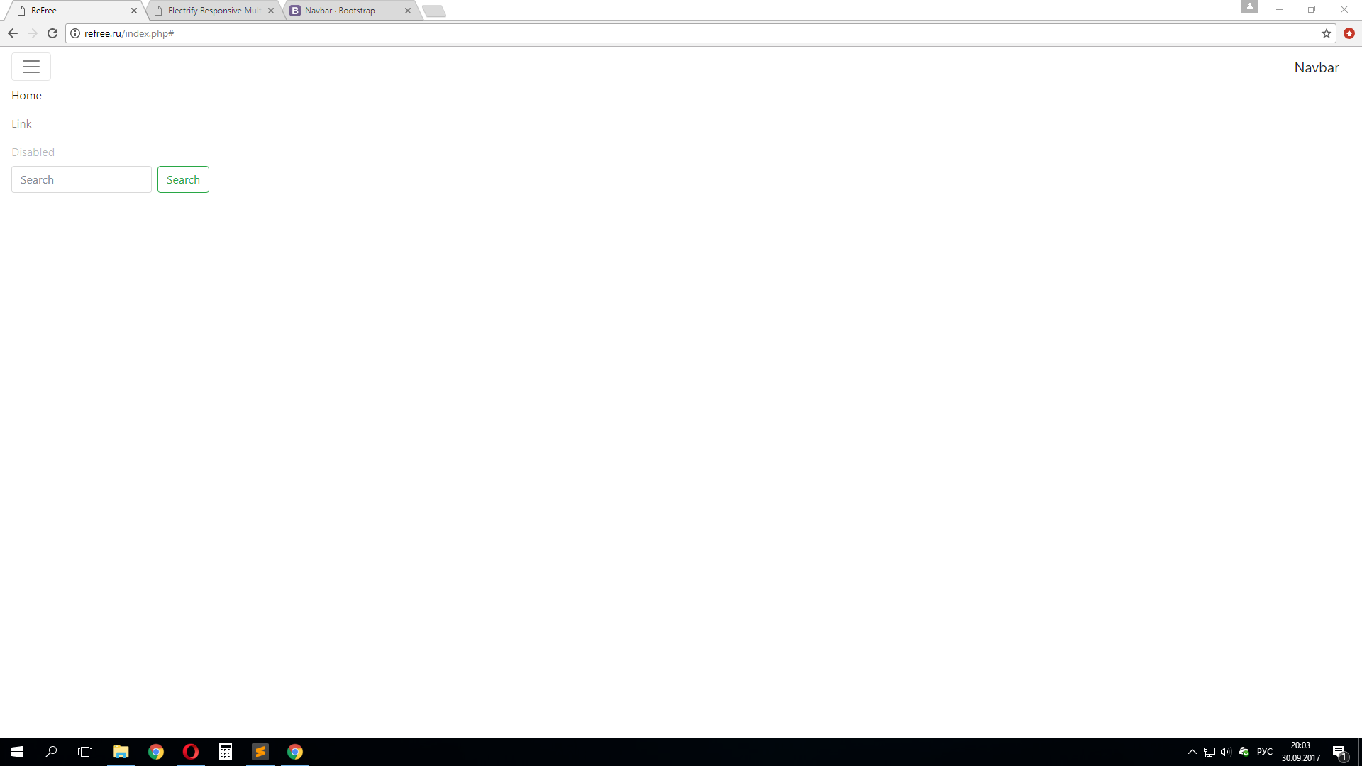
Answer the question
In order to leave comments, you need to log in
Didn't find what you were looking for?
Ask your questionAsk a Question
731 491 924 answers to any question