A
A
Andrew2018-05-07 01:17:18
HTML
Andrew, 2018-05-07 01:17:18

Why does mobile chrome scale and position some elements incorrectly?

If the page has a tag and its content like this:

<meta name="viewport" content="width=device-width, initial-width=1.0"/>

then the browser scales the page on a mobile device.
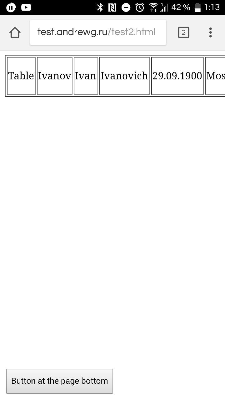
But in chrome on mobile android, if you add, for example, a button with a fixed position at the bottom, and the page does not fit in width (for example, if there is a long table), then the button leaves the screen (it feels like it leaves in such a way as to maintain the proportions of the document ).
Example
spoiler
5aef7e6f0508e108252936.jpeg

If you add
user-scalable=no
it, the button is displayed as needed, but, accordingly, the scaling will disappear.
Example
spoiler
5aef7e7b53b8e966333036.jpeg

There is no such problem in mobile firefox.
Why is this happening and how is it right to win?

Answer the question

In order to leave comments, you need to log in

1 answer(s)
A
Anton Spirin, 2018-05-07
@byte916

Prevent horizontal scrolling for the entire page on the mobile version.
For tables, you can use a container with a scroll.
Read the article about tables in responsive design .
There are ready made solutions.

Didn't find what you were looking for?

Ask your question

Ask a Question

731 491 924 answers to any question