Answer the question
In order to leave comments, you need to log in
Why does it adapt on the desktop, but not on Android?
Hello.
In general, there is a site layout ( pstroh440.zzz.com.ua/www ). I use bootstrap features, but not the grid, as the designer decided not to give a damn about the grid. Made everything by hand. But if you narrow the window on the desktop, then adaptability is normally visible even under 320px, and if you log in from the phone, it does not fully adapt. I can't figure out why. Any ideas?
Subject: pstroh440.zzz.com.ua/www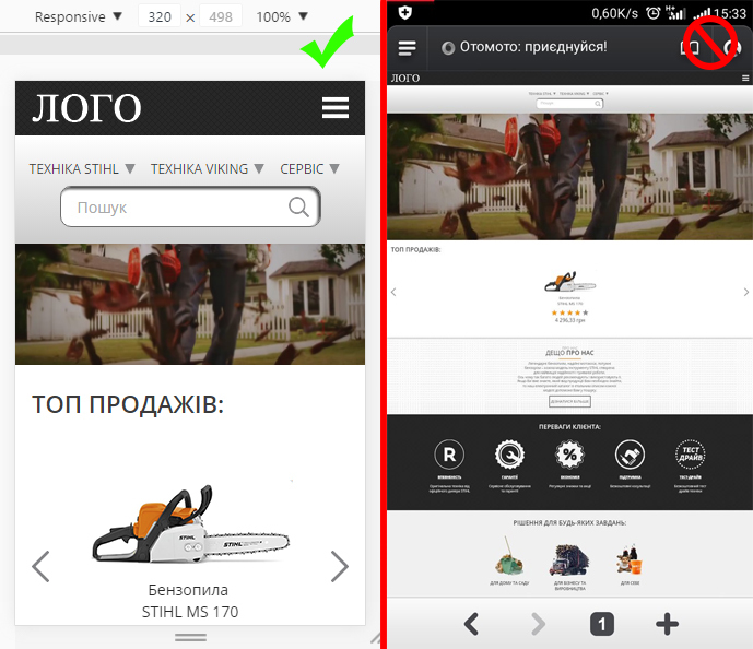
Answer the question
In order to leave comments, you need to log in
Found a solution! I didn't duplicate the width of the elements in media queries. Specified a minimum, maximum and just a width of 100% on the first media query of 1200px. It would make sense if it just continued on to subsequent, smaller requests, but no. Duplicated everywhere and it worked.
And Android can correctly display the layout?
Certainly! It's Android!
<meta name="viewport" content="width=device-width, initial-scale=1, maximum-scale=1, minimum-scale=1, user-scalable=no, minimal-ui">Didn't find what you were looking for?
Ask your questionAsk a Question
731 491 924 answers to any question