N
N
Nikita Ivanov2015-06-22 22:34:12
HTML
Nikita Ivanov, 2015-06-22 22:34:12

Why does border-radius stop working for transition time?

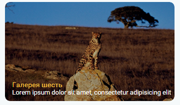
In general, on one site , I have a block in which there is an image that occupies 100% of the block

<div>
     <img src="image.png">       
</div>

This block has border-radius:10px and overlay:hidden
Image at 100% block width
When hovering over the block, the image is enlarged by 30% through transform: scale() and a little blur is applied to it
div{
  overflow: hidden;
  border-radius: 10px;
  width: 300px;
  height: auto;
}
img{
width:100%;
border-radius: 10px;
transition: 1s all;
}
div:hover img{
-webkit-transform: scale(1.30, 1.30);
  -ms-transform: scale(1.30, 1.30);
  transform: scale(1.30, 1.30);
  -webkit-filter: blur(2px);
  filter: blur(2px);
}

So, during the transition of the image - border-radius and overfow:hidden seem to disappear
. Or rather, they are, but what goes beyond the rounded corner is displayed quite dimly.
And after the animation is over, everything looks as it should.
It looks like this:
1) There is no hover
773cb1d348da4f489c7891fa502a4b2a.PNG
2) Move the mouse, the animation starts, the corners appear
3276e1afc08648558ec340e662226620.PNG
3) The animation ends, the corners disappear again
c0f11f6639d7470ab97f240fd04661bc.PNG
During the reverse animation - "angularity" also appears
Uploaded on jsfiddle

Answer the question

In order to leave comments, you need to log in

1 answer(s)
E
Evgeny Petrov, 2015-06-22
@rekurt

How to round the corners of an image when the hover zoom effect is used?
your example

Didn't find what you were looking for?

Ask your question

Ask a Question

731 491 924 answers to any question