Answer the question
In order to leave comments, you need to log in
Why does Bootstrap grid not work properly with Owl Carousel?
Hello. I need to create a section with cards where team members will be displayed. One "slide" Owl Carousel should display 4 cards. + I need to arrange them according to Bootstrap's grid. If the plugin is removed, then everything is displayed perfectly. I want to note that with smaller extensions than 1199 px it displays normally (3-2 cards per slide). This is what the result of the code looks like: 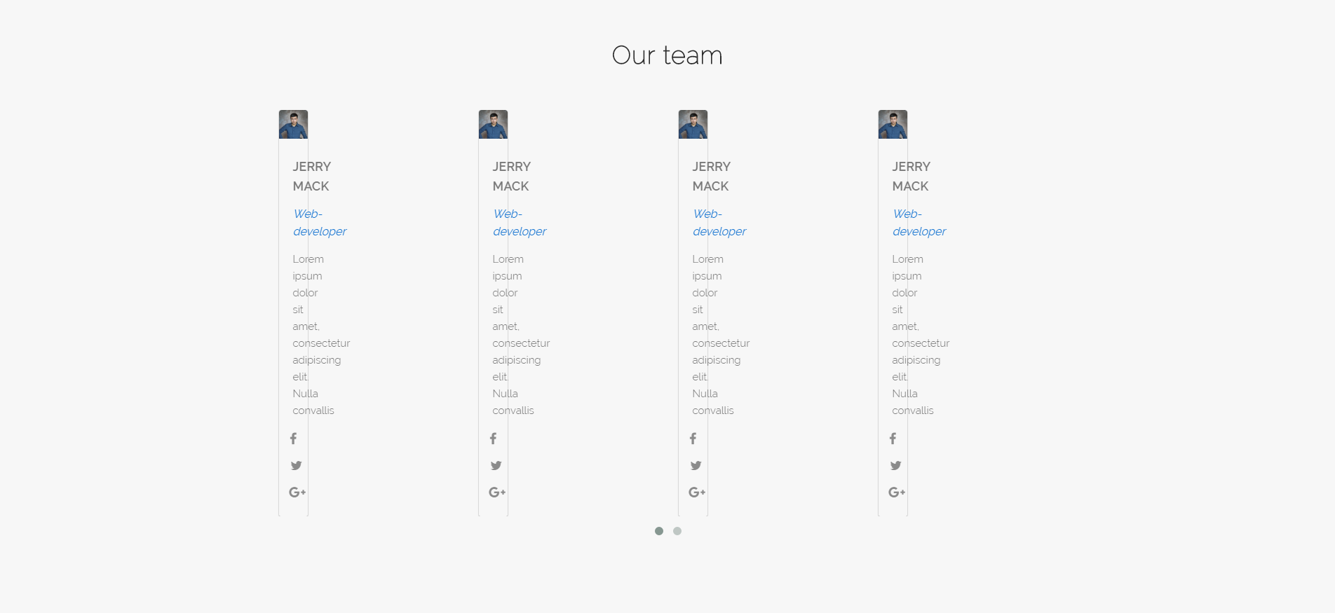
Don't worry about the HTML, it's just 5 identical blocks of code .
HTML
<section id="team">
    <div class="container">
      <h4>Our team</h4>
      <div class="owl-carousel team-members">
        <div class="col-md-3 col-sm-3">
          <div class="member">
            <div class="member-img">
              <img src="img/man.png" alt="">
            </div>
            <div class="member-info">
              <span>Jerry Mack</span>
              <i>Web-developer</i>
              <p>Lorem ipsum dolor sit amet, consectetur adipiscing elit. Nulla convallis</p>
            </div>
            <div class="member-contacts">
              <i class="fa fa-facebook"></i>
              <i id="middle-icon" class="fa fa-twitter"></i>
              <i id="last-icon" class="fa fa-google-plus"></i>
            </div>
          </div>
        </div>
      </div>
    </div>
  </section>
$(document).ready(function() {
$(".team-members").owlCarousel({
autoPlay: 3000,
items : 4,
itemsDesktop : [1199,4],
itemsDesktopSmall : [973,3]
});
});Answer the question
In order to leave comments, you need to log in
Because every element is wrapped in .owl-item automatically, .col-md-3 means 25% of that class. Therefore, along with .col-md-3, you should prescribe .owl-item with your hands so that these classes hang on the same Div. In this case, all BootStrap'ovskie classes work properly.
PS Thanks to those who responded!
Didn't find what you were looking for?
Ask your questionAsk a Question
731 491 924 answers to any question