Answer the question
In order to leave comments, you need to log in
Why does a line in Adobe XD have an indent of 0.5px relative to other elements?
Hello!
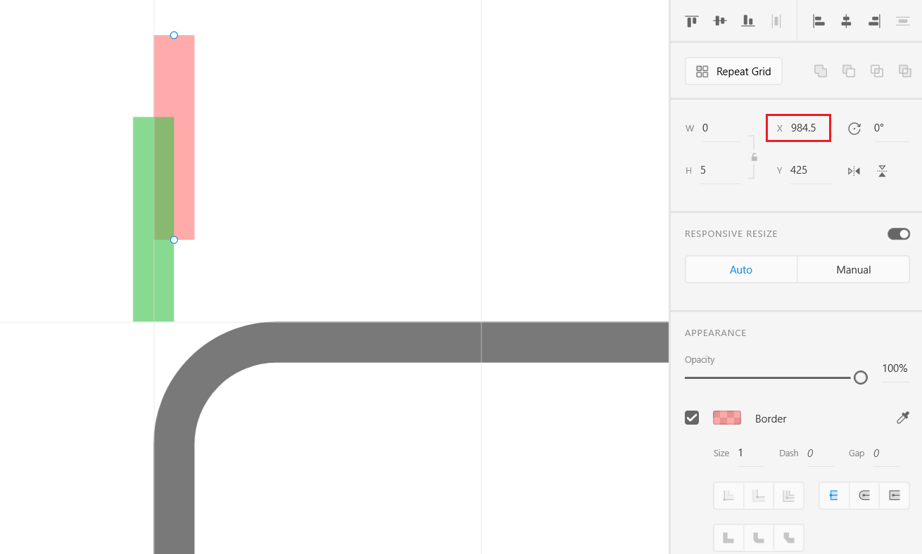
I study UI and draw trial interfaces in Adobe XD. And the question arose, why by default the Line element (green) is shifted relative to the Rectangle (gray) by 0.5px?
Is it acceptable to use half padding (pink line) to align both the line and the rectangle to the left?
Thanks
Answer the question
In order to leave comments, you need to log in
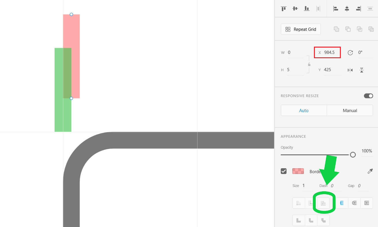
Try changing the Rectangle element's Border settings to Center Stroke.
A straight line can be defined as a line along which the path is equal to the shortest distance between two points, or the length minus the width (from the wiki).
Adobe HD (and others) perceive it this way, i.e. there are start/end coordinates and a parameter - width! The width can be any, the default is 1 and the EU, but it is distributed evenly "on the sides", that's the offset.
By the way, this is why many people recommend not to use this primitive (line) but to use a "rectangle" and so on.
Didn't find what you were looking for?
Ask your questionAsk a Question
731 491 924 answers to any question