Answer the question
In order to leave comments, you need to log in
Why do words wrap in tabs?
Hello, I'm making a menu using nav-pills, Bootstrap4, as planned on mobile devices, pills are located in a container with a horizontal scroll, so you need the text to be written in one line, but for some reason it always wraps. I don’t understand at all what the reason is, I didn’t find any rules affecting this. Here is the screenshot: 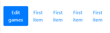
Here is the code:
<ul class="nav nav-pills nav-justified nav-pills-mobile"  id="myTab" role="tablist">
                <li class="nav-item nav-pills" >
                  <a class="nav-link active" id="1stitem-tab" data-toggle="tab" href="#1stitem" role="tab" aria-controls="1stitem" aria-selected="true">First item</a>
                </li>
                <li class="nav-item nav-pills">
                  <a class="nav-link " id="1stitem-tab" data-toggle="tab" href="#1stitem" role="tab" aria-controls="1stitem" aria-selected="false">First item</a>
                </li>
                <li class="nav-item nav-pills">
                  <a class="nav-link " id="1stitem-tab" data-toggle="tab" href="#1stitem" role="tab" aria-controls="1stitem" aria-selected="false">First item</a>
                </li>
                <li class="nav-item nav-pills">
                  <a class="nav-link " id="1stitem-tab" data-toggle="tab" href="#1stitem" role="tab" aria-controls="1stitem" aria-selected="false">First item</a>
                </li>
                <li class="nav-item nav-pills">
                  <a class="nav-link " id="1stitem-tab" data-toggle="tab" href="#1stitem" role="tab" aria-controls="1stitem" aria-selected="false">First item</a>
                </li>
                <li class="nav-item nav-pills">
                  <a class="nav-link " id="1stitem-tab" data-toggle="tab" href="#1stitem" role="tab" aria-controls="1stitem" aria-selected="false">First item</a>
                </li>
                <li class="nav-item nav-pills">
                  <a class="nav-link " id="1stitem-tab" data-toggle="tab" href="#1stitem" role="tab" aria-controls="1stitem" aria-selected="false">First item</a>
                </li>
</ul>.nav-pills-mobile{
padding: 10px;
overflow-x: auto; overflow-y:hidden;flex-wrap: nowrap;
}
.nav-pills-mobile li {
text-align: center;
display: inline-block!important; //отчаяние :(
}
.nav-pills-mobile li a{
clear:both;
float:left;
}Answer the question
In order to leave comments, you need to log in
Didn't find what you were looking for?
Ask your questionAsk a Question
731 491 924 answers to any question