Answer the question
In order to leave comments, you need to log in
Why do many designers make design elements HUGE?
Greetings.
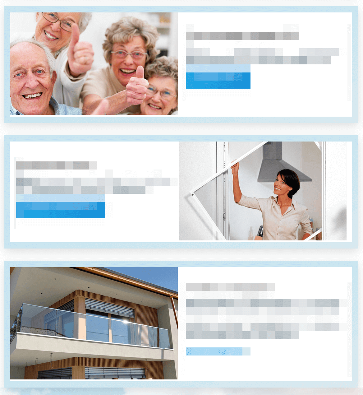
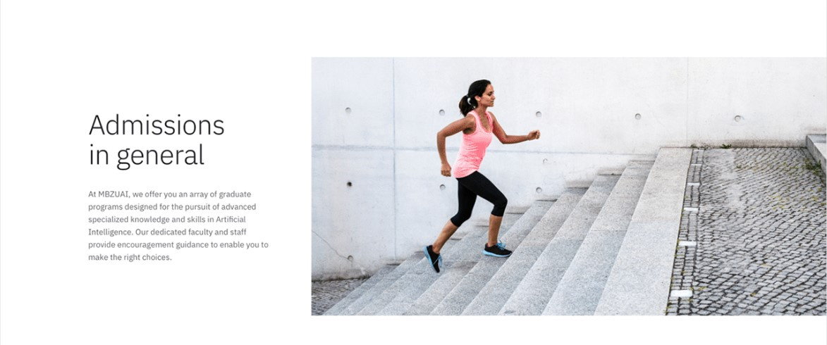
Designers, explain to me why you and your colleagues make such huge design elements. I have a 1500px height monitor and I sometimes, and sometimes more often, go crazy with such sizes. Here's an example for you:

Answer the question
In order to leave comments, you need to log in
Since I am a representative of a species of animals called designers, I will explain my point of view.
1. A good designer will check the display of his layout on different screen resolutions - this means that his layout will be rendered for FullHD, HD, tablets and phones.
2. Often, large pictures are made for marketing purposes, in the event that during the study the task was set to sell using photographs.
3. In order not to distract the user with different information, in landing pages, the presentation of information is divided into screens, one topic is one screen, which is why some designers like to draw one block equal to the entire laptop screen.
4. Returning to the topic of the third point, some designers are very fond of stretching a minimum of information onto a large element, thereby filling the screen area - this is ignorance, and inexperienced designers do this.
A few good examples when a picture sells:

Large elements are usually for adaptability. It is more convenient on the phone and a small amount of content does not look so lonely.
But why they make a photo on the main page in full screen is a mystery to me.
Everything is right about the focus on the button and directing the user's attention...
But... dear designers, do not judge strictly, but according to my observations, the adaptability and the mobile-first principle here are more for blurring the eyes and the coolness of the sound of the specialist's answer. :) More often, the point is that there are no ideas in terms of design, but you need to fill the space with something ... otherwise the client will not understand what he paid for ... then a wildly serious face and a cool reception are used - " it's a fashionable feature" or "you have to stand out with something"... like it's a cool design... well, like Lebedev's... or Malevich's square... :)
Sorry for the banter, but I'm sure that both At least, this is partly true.
Considering that every first young talent, asserting himself in the opinion that he is a designer, first acquires a 4k monitor, a lot of design trends fall into place.
What is the problem with the screen? here the photo sells and the big button should conveniently sell this product.
At the moment, websites are mainly developed according to the principle of mobile-first. It means that first of all the site should be displayed correctly on mobile devices. And only then do they think about users from the desktop, so it turns out that way.
Why do many designers make design elements HUGE?They are NOT designers.
As far as I can tell from the screenshot, a certain service is being offered for the elderly, perhaps pensioners. It is no secret that the problems of visual impairment with age occupy an increasingly special place, and this point should be taken into account in products for such users. And this is such a case, as I see it)
Just like that, from the bulldozer, a rare iiot is able to increase the size. Why don't you ask the author directly about the purpose of such a solution?
There is such a thing as a knife, there is such a thing as design.
Here is an example of a knife. In one case, you can take a knife, spread butter with caviar on bread and treat the guest. In another case, you will stick the same knife in the belly of a bandit, defending yourself. The third time you use the same knife to open hard clay, helping the archaeologist. And when the next morning you go to shave in field conditions, put the knife under the mirror...
And the design, you bastard, is the same as that knife - it all depends on what and why... Therefore, it is not clear how advertising design can be compared and CMS design.
And one more thing: in my programs on my computer, the small size of the buttons is almost always set - so that they take up less space. But if it is important for me to hit the button quickly, I will set the interface to a large size. I have an ordinary male hand and often, now I'm talking about the smartphone screen, I'm FUCKED by the small size of the controls. It happened that the finger covered two neighboring interactives at once.
I recalled an article on print design by a friend 15 years ago, in which there was an amazing line (it seems to have become famous) "And never, never use a 12 point font ..." (not verbatim).
Didn't find what you were looking for?
Ask your questionAsk a Question
731 491 924 answers to any question