Answer the question
In order to leave comments, you need to log in
Why are the images stretched during the layout of the letter when testing for the mobile version?
Hello!
For the first time I'm designing a page for an email newsletter. Please help me figure out why on the desktop and tablet versions the pictures look normal when making up the letter, but on the mobile one they stretch? I have fixed width and height (specially indicated them in almost every tag, just in case). In theory, everything should remain with the specified dimensions, just with a scroll bar in the browser.
Here is the code:
<table width="600" height="32" cellpadding="0" cellspacing="0" border="0" style="border-collapse: collapse; margin: 0; padding: 0; height: 32px; text-align: center; font-size: 0;">
   <tr>
       <td width="24" height="32" align="center" valign="middle" style="margin: 0; padding: 0; background-color: #c94024;">
            <div style="height: 32px; margin: 0; background-color: #c94024;"></div>
       </td>

       <td width="144" height="32" align="center" valign="middle" style="margin: 0; padding: 0;background-color: #e5e5e5;">
           <a href="#" target="_blank" style="width: 144px; line-height: 32px; height: 32px; background-color: #e5e5e5; cursor: pointer; text-decoration: none;">
               <img src="..." alt="linkedIn" border="0" width="19" height="16" style="display:block;">
           </a>
       </td>

       <td width="144" height="32" align="center" valign="middle" style="margin: 0; padding: 0;background-color: #cccccc;">
           <a href="#" target="_blank" style="width: 144px; line-height: 32px; height: 32px; background-color: #cccccc; cursor: pointer; text-decoration: none;">
              <img src="..." alt="facebook" border="0" width="9" height="16" style="display:block;">
           </a>
       </td>

       <td width="144" height="32" align="center" valign="middle" style="margin: 0; padding: 0;background-color: #b5b5b5;">
          <a href="#" target="_blank" style="width: 144px; line-height: 32px; height: 32px; background-color: #b5b5b5; cursor: pointer; text-decoration: none;">
               <img src="..." alt="twitter" border="0" width="19" height="13" style="display:block;">
          </a>
        </td>

        <td width="144" align="center" valign="middle" style="margin: 0; padding: 0;background-color: #939393;">
           <a href="#" target="_blank" style="width: 144px; line-height: 32px; height: 32px; background-color: #939393; cursor: pointer; text-decoration: none;">
               <img src="..." alt="instagram" border="0" width="16" height="16" style="display:block;">
           </a>
        </td>

   </tr>
</table>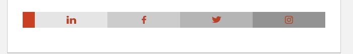

Answer the question
In order to leave comments, you need to log in
1) prntscr.com/db5ugi
2) why does the image have display: block?
3) for the future, for some mailers it is better to write not margin: 0 but margin-top: 0; margin-left: 0; etc. The same goes for paddings and all properties that can have multiple values. They must be listed separately.
1) put a missing height on the cell with instagram - nothing has changed : (
2) display: block; - a hack for Outlook, if you do not set display: block, then Outlook will add indents to the picture (I read it on Habré)
3) thanks for the advice
Didn't find what you were looking for?
Ask your questionAsk a Question
731 491 924 answers to any question