Answer the question
In order to leave comments, you need to log in
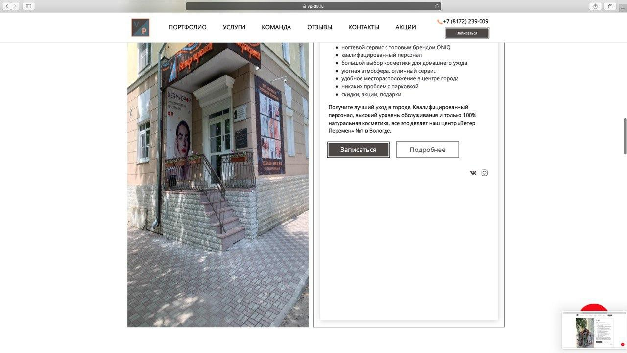
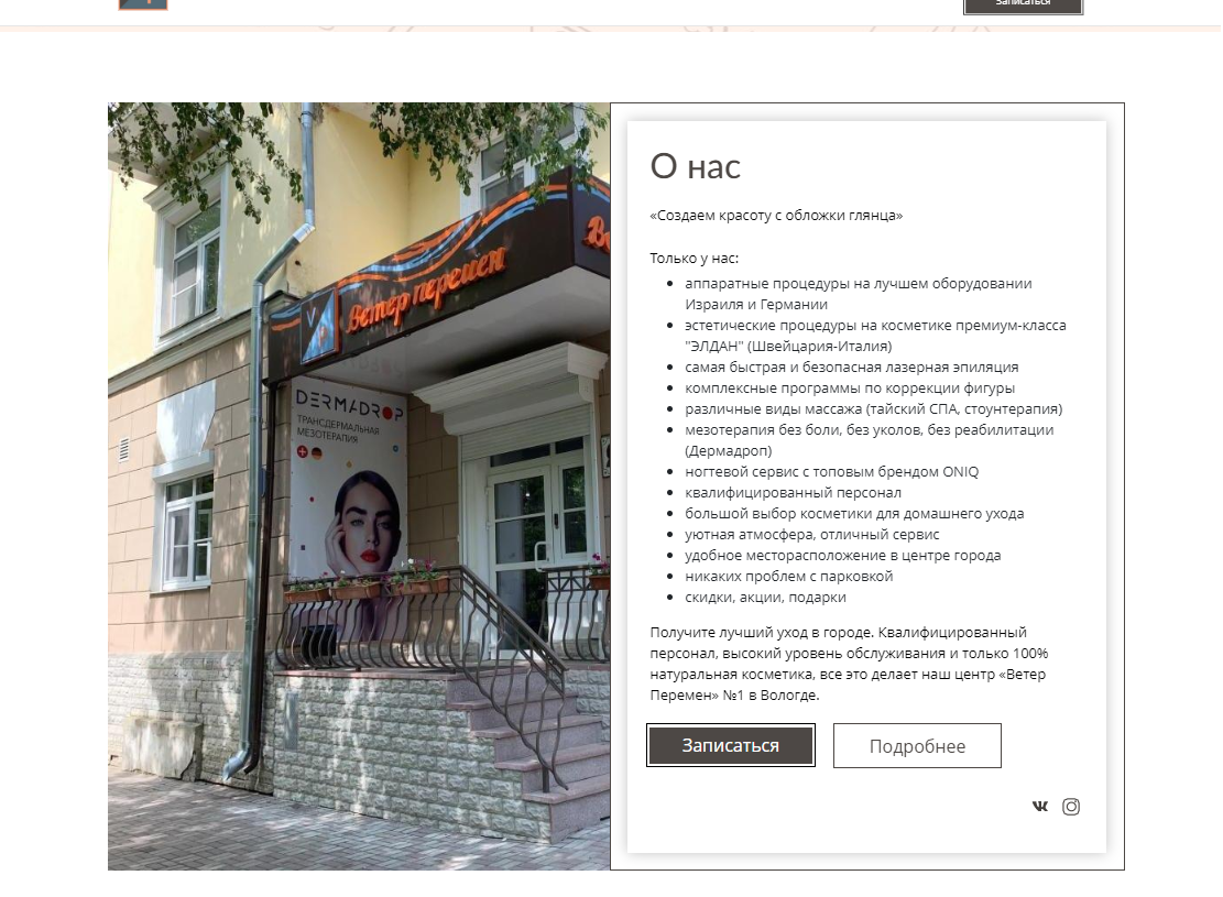
Why are images stretched vertically in safari?
 I use gulp scss for layout. Sometimes it happens that on the whole site one image or one block of images is displayed crookedly only in safari. In Yandex, Chrome, Edge, everything is fine, everything is fine on mobile browsers, and in safari on desktop and mobile (apple) images are stretched horizontally, it is not clear for what reason, prefixes are for flex, etc. For the image itself, it is set limitation on width, on height as auto.
I read once that you need to set min-height:1px for safari, but the source is dubious and I did not find any articles on the Internet that you need to do this for cross-browser compatibility under safari, besides, it does not help. The only way that works is to set the block height to a constant, but this is not always possible, there are images that simply need to change depending on the view width or block width, and the height dance for the width in proportion without stretching and shrinking and in this case , for such an image, you have to set the height with a constant in the media every 100px of the view width. Unfortunately, I don't have a project right now that I could publish to demonstrate my problem, but a few screenshots have survived.
Answer the question
In order to leave comments, you need to log in
Didn't find what you were looking for?
Ask your questionAsk a Question
731 491 924 answers to any question