Answer the question
In order to leave comments, you need to log in
Why adaptability works strangely?
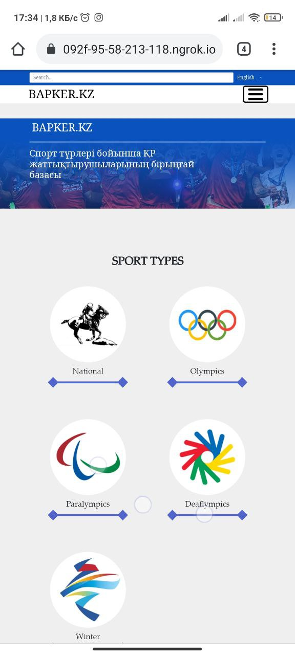
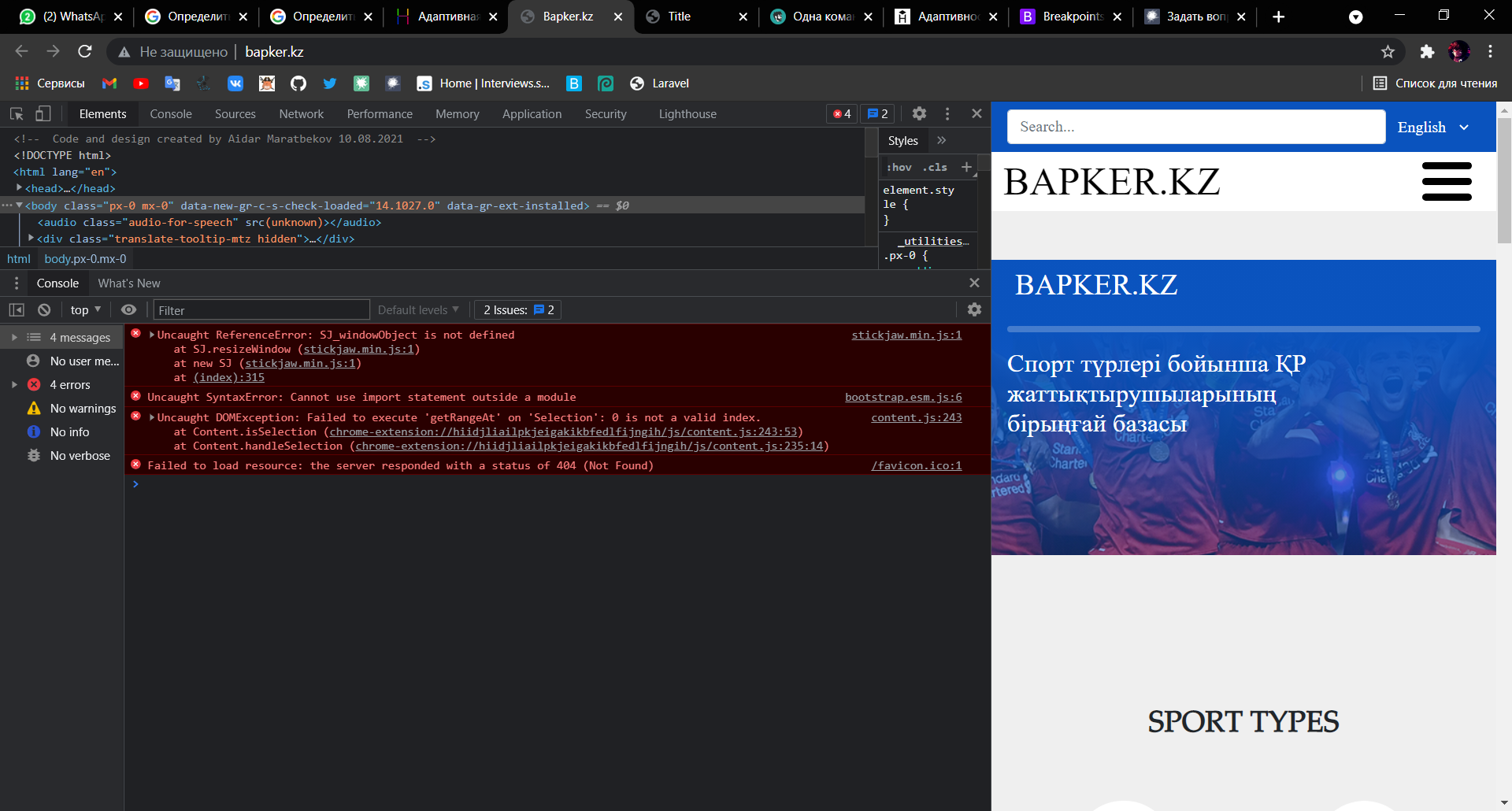
Why does adaptivity behave this way? The first screen is from a smartphone, and the second is from a browser window. I thought everything was fine when I looked and did comparing it with the window in the bowser by reducing the width of the browser. And as soon as I thought everything was over, I decided to open the site on the phone, and now it’s disappointing, there was no adaptability. What to do? I have not done layout for a long time and forgot a lot. I built adaptability through bootstrap, namely with the help of col-12 col-lg-10 col-md-8 and so on
https://092f-95-58-213-118.ngrok.io opened a local one, you can follow the link and see .
Answer the question
In order to leave comments, you need to log in
<meta name="viewport" content="width=device-width, initial-scale=1, maximum-scale=1"/>Didn't find what you were looking for?
Ask your questionAsk a Question
731 491 924 answers to any question