Answer the question
In order to leave comments, you need to log in
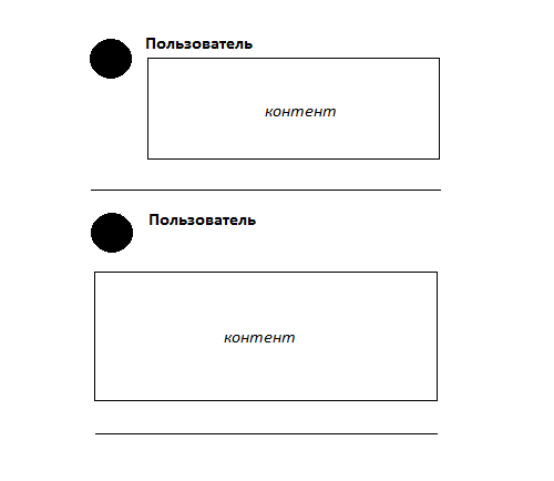
Which forum post design would you prefer?
So far I've only seen two implementations of messages: 
Perhaps you know sites with custom message designs, or do you have your own thoughts on how to implement them?
Answer the question
In order to leave comments, you need to log in
If there are more buns under the ava, then the first ofk. And for small screens the second.
Or a style switcher, why be trifles.
If the target audience is accustomed to forums, then the non-standard design will seem uncomfortable to them.
In general, a question from the series of what to wear today.
First. It's good when all the text parts are aligned with each other.
Didn't find what you were looking for?
Ask your questionAsk a Question
731 491 924 answers to any question