Answer the question
In order to leave comments, you need to log in
Which chart to choose for visualizing a large amount of data?
Please tell me what type of chart to use on the site if you need to display the change in the number of unit sales from month to month, taking into account the fact that there may be a little more than 100 items. There is nowhere to cluster. Initially, the sample is several thousand items, and the subgroup is about 100 items. It is necessary to present monthly graphs of changes in sales volume on the site. There is an option to use a Tree map, but it seems to be a little different. How to be?
Answer the question
In order to leave comments, you need to log in
Before visualizing such large amounts of data, one important question should be considered. What for?
If you need a beautiful picture, then you can choose a beautiful visualization. Look, for example, at tableau. And if you need a useful tool, then simple and understandable diagrams can be enough, but for specific things. For example, in order to visualize the historical change in the ruble exchange rate, there is nothing better than a regular chart.
Look at the target audience and the tasks to be solved. This is especially important for economic datasets.
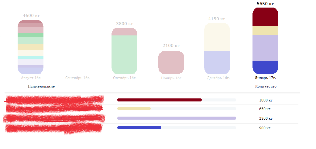
I want to add. There is an example of solving the issue for a small number of items. Approximately for 15-20. 
Here, switching on the upper charts below, statistics for each of these charts appear. But how to do something similar if there are 5 times more names?
Didn't find what you were looking for?
Ask your questionAsk a Question
731 491 924 answers to any question