Answer the question
In order to leave comments, you need to log in
When scaling for adaptation, the block is trimmed. How to solve the problem?
I'm trying to make the layout responsive. In the developer menu in Chrome, I'm trying to see how the site will look on mobile devices. But the header block is truncated like this: 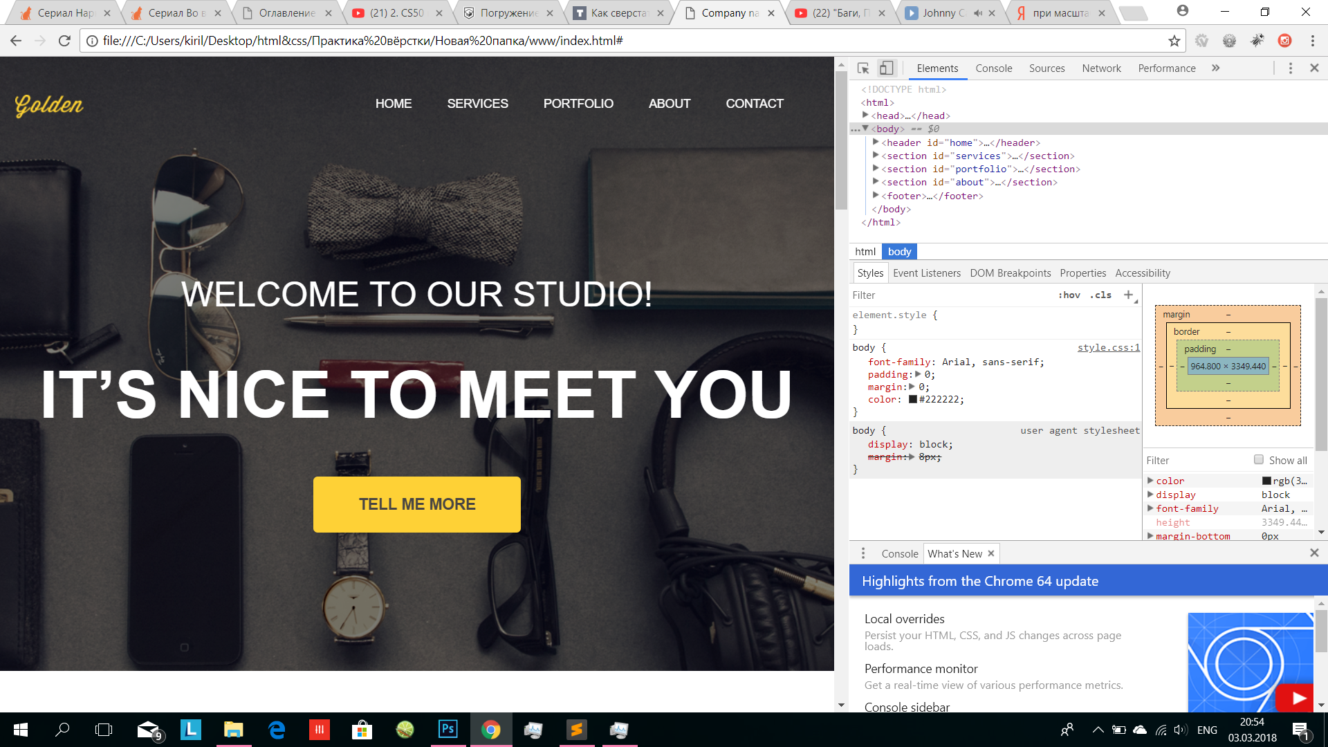
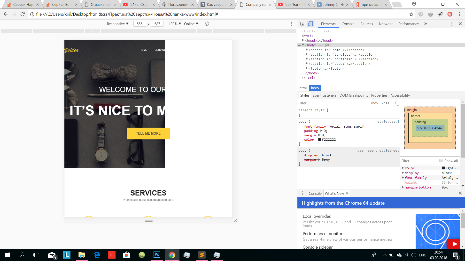
How to solve this problem?
<header id="home">
      <div class="container">
        <div class="heading clearfix">
          <img src="images/logo.png" alt="" class="logo">
          <nav>
            <ul class="menu">
              <li><a href="#home">Home</a></li>
              <li><a href="#services">Services</a></li>
              <li><a href="#portfolio">Portfolio</a></li>
              <li><a href="#about">About</a></li>
              <li><a href="#">Contact</a></li>
            </ul>
          </nav>
        </div>
        <div class="titles">
          <div class="titles_first">
            Welcome To Our Studio!
          </div>
          <h1>It’s nice to Meet you</h1>
        </div>
        <a class="button" href="#">Tell Me More</a>
      </div>
    </header>
body {
font-family: Arial, sans-serif;
padding: 0;
margin: 0;
color: #222222;
}
.clearfix:after {
content: "";
display: table;
width: 100%;
clear: both;
}
header {
background: url(../images/first-bg.png) no-repeat center top / cover;
padding-bottom: 160px;
}
.div {
box-sizing: border-box;
}
.container {
width: 930px;
margin: 0 auto;
}
.logo {
margin-top: 44px;
float: left;
}
nav {
float: right;
margin-top: 45px;
}
.menu {
padding: 0;
margin: 0;
display: block;
}
.menu li {
float: left;
display: block;
margin-right: 41px;
}
.menu a {
color: #fff;
text-decoration: none;
text-transform: uppercase;
font-size: 14px;
}
.titles_first {
font-size: 40px;
color: #fff;
text-transform: uppercase;
text-align: center;
margin-top: 180px;
}
h1 {
font-size: 75px;
color: #fff;
text-transform: uppercase;
text-align: center;
margin: 15;
}
.button {
background-color: #fed136;
color: #484543;
text-decoration: none;
text-transform: uppercase;
font-size: 18px;
text-align: center;
box-sizing: border-box;
height: 65px;
width: 240px;
display: block;
font-weight: bold;
padding: 23px 50px;
border-radius: 5px;
margin: 0 auto;
margin-top: 50px;
}Answer the question
In order to leave comments, you need to log in
This happens when there is an element that has a fixed width that is larger than the parent's width. Try using the block selection tool on hover (I don’t know what it’s called, it seems to be activated on Ctrl + shift + C) to find this element by simply selecting it and dragging the mouse over the white part of the page
Didn't find what you were looking for?
Ask your questionAsk a Question
731 491 924 answers to any question