Answer the question
In order to leave comments, you need to log in
What's wrong with the block?
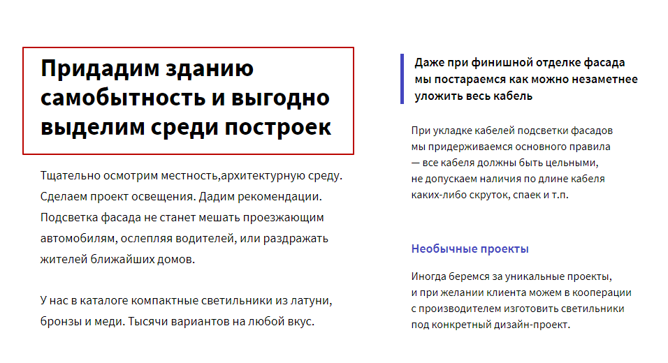
In general, here is a fragment of the text block, how it looks at 1170: 
(here the layout designer marked the text in a red frame and asked how to do it)
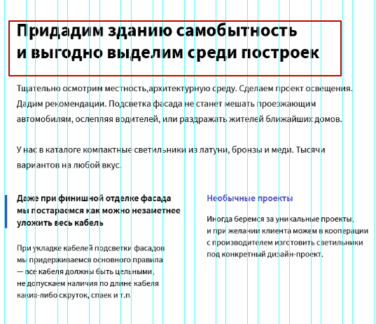
On the tablet version, I made the block like this: 
What didn’t I smoke? Why it was impossible (or possible) to do so, what is the trouble?
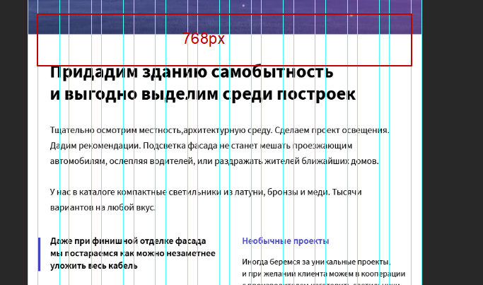
+I used the downloaded bootstrap grid, the width of the grid with all the padding in the tablet version was 764px, to which the layout designer wrote that the width should be 768px specifically here: 
Why 768 specifically? why do other grids on the internet have a width of 750? What is the problem with laying out like in the second picture with a grid of 764?
Answer the question
In order to leave comments, you need to log in
As for me, a regular grid, for example, on bootstrap it will be something like this: col-xs-12 col-lg-6
You can also do it manually through media queries. I don't see any problems.
Maybe you don't agree on something?
Didn't find what you were looking for?
Ask your questionAsk a Question
731 491 924 answers to any question