Answer the question
In order to leave comments, you need to log in
What's the best way to adapt?
Code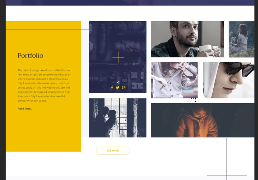
This is how this section looks on the layout.
It is difficult to describe how clumsily the adaptive of this section looks, just look and everything will become clear.
Tell me how it would be better to make an adaptive of this section.
Answer the question
In order to leave comments, you need to log in
Portfolio title and text (on yellow) full width and top render (100%).
Pictures underneath.
To do this, the part of the portfolio with pictures should be in its own div, wrap all columns in the parent tag.
Further with columns or following the bootstrap example - by percentage. Or rebuild them into lines.
Here you have to look for yourself.
But in order to work with this at all, there are two tags inside .porfolio. 1 is a container for text. 2 - container for pictures and "see more" buttons.
They can already be rebuilt on their own. Flex is the best.
In general, if you need an adaptive and there is no design for at least two more screens, it’s good to take a bootstrap and build on it in an adaptive.
The main thing is to correctly distribute the columns and rows.
Didn't find what you were looking for?
Ask your questionAsk a Question
731 491 924 answers to any question