Answer the question
In order to leave comments, you need to log in
What's going on with the layout?
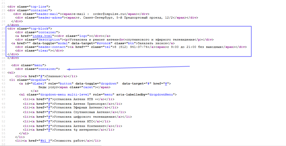
Hello! please tell me what happens to the layout when viewed from a mobile device, the site is simply cut off and the content goes beyond the container, I can’t understand what is the reason! Help me please! labserver.ru/ant
Answer the question
In order to leave comments, you need to log in
ul.tabs-wr - fixed width.
.text-wr - fixed width.
The menu is not adaptive at all, like many other things.
When something does not help, read the instructions))) https://getbootstrap.com/examples/non-responsive/ Follow the instructions strictly and you will be happy.
The question has already been raised! I already wrote to type again!
Example of a correct block:
<div class="container-fluid">
    	<div class="row">
    		<div class="col-xs-12 col-sm-12 col-md-12 col-lg-12">
    			<!-- А тут уже ваша конструкция -->
    		</div>
    	</div>
    </div>
Didn't find what you were looking for?
Ask your questionAsk a Question
731 491 924 answers to any question