Answer the question
In order to leave comments, you need to log in
What price to form for the development of a billboard?
Developed within 2 days a logo, business cards, corp colors and a billboard + prepress preparation of everything. In general, I am interested in what price I can indicate to the customer, given that I am a novice designer (if you can call me that), thank you in advance.
photo of work attached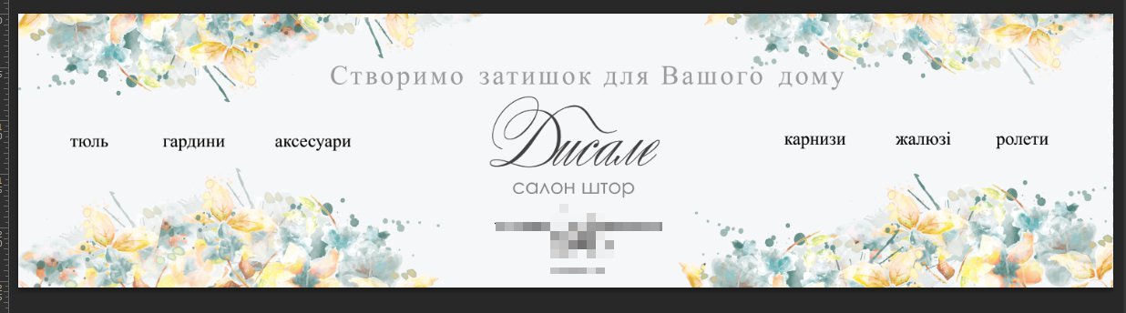

Answer the question
In order to leave comments, you need to log in
Depends only on the customer. Try to charge a couple of thousand for the logo and 500-1000 for every other layout.
Prices in rubles.
the billboard looks like the site header)
But on the topic, the prices are different, evaluate your time spent, and not what you did)
First, the price is negotiated, then the work is done. without a watermark, files are given only after full payment, no matter what the customer hangs (this is so, for the future)
According to the work itself. IMHO:
Billboard? Correctly noted - it looks like a website header, but there is nothing wrong with that)) but the name should be BIGGER, the words should also be larger, otherwise it is simply unreadable.
Business cards - firstly, a BIGGER name, it must be increased by at least 30 percent. Secondly, it is better to do it in a vector (even if the pictures are raster) , in my opinion, prepress is much more convenient, especially with Corel, thirdly , if the drawing or fill is at the edge, then on the layout for printing it should go beyond the edge by 3-5 mm, so that when cutting business cards(which rarely turns out to be perfect, especially for the entire batch) , there were no white stripes between the edge of the picture and the edge of the business card.
"We have everything for your windows" raise a little higher so that there is a little more free space between the inscription and the line, in the list itself, also make the distance between the items a little larger. A plate with contacts, if it’s so impatient to do it, it’s better to make it ... well, xs ... pale pink or something, it’s more appropriate there than yellowish-greenish, it makes sense to repaint the green plate at the bottom of the mb, for example, in blue, which can be taken from the back.
Didn't find what you were looking for?
Ask your questionAsk a Question
731 491 924 answers to any question