Answer the question
In order to leave comments, you need to log in
What is this new trend in website/portal layout?
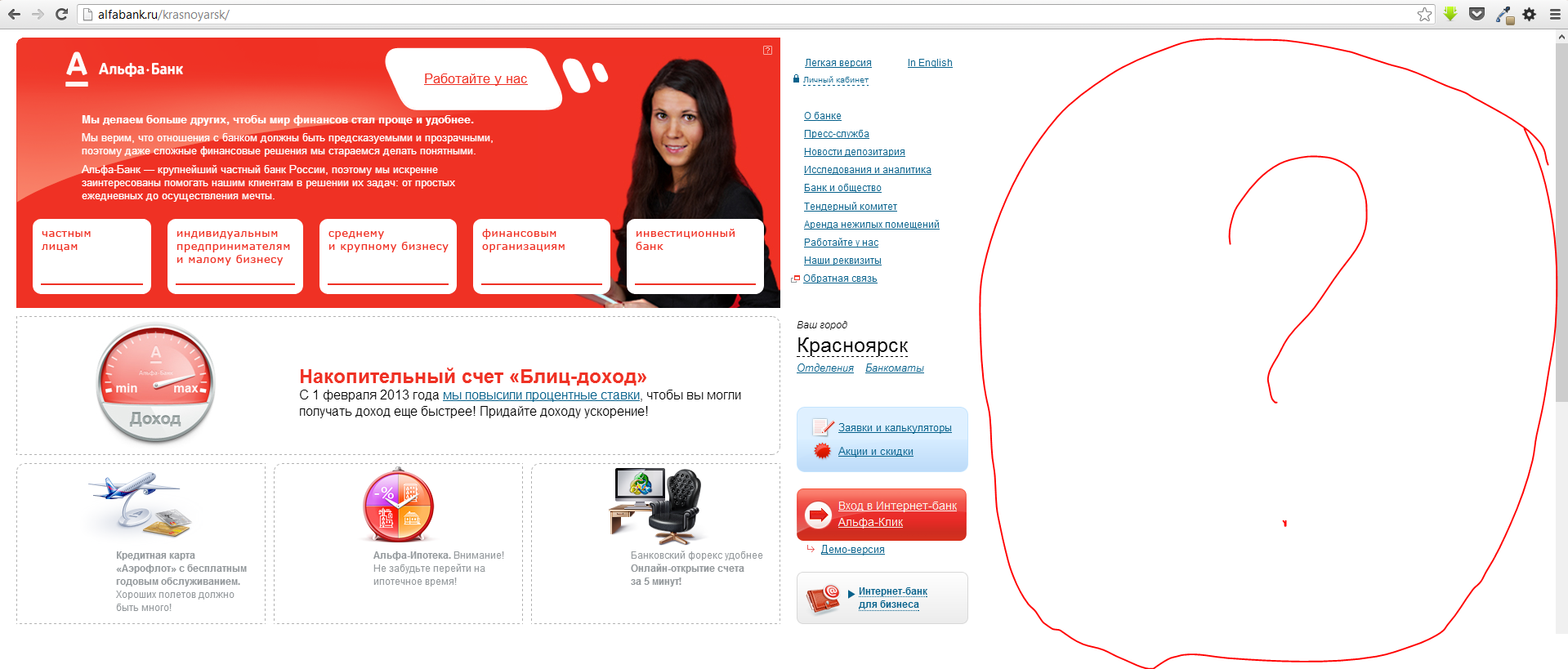
For some time now, companies have started using layouts that don't look good on large screens. They are stuck to the left edge of the screen, there is a lot of empty space on the right, the eyes have to be squinted to the left.
I first noticed this on Google. And recently, this appeared at Lenta.ru with Alfa-Bank. Is this a new trend or what?
Answer the question
In order to leave comments, you need to log in
I don't know about others, but Google uses the right space to view the page cache.
Alfabank also has signs :) I don't know why they do it. Google - apparently for quick viewing (when the site screen pops up).
Also drew attention. Lazy layout for mobile browsers? In the phone (I’ll look at the iPad in the evening, but I think it will be the same), there is no white field either in landscape or portrait orientation.
And there were also a lot of jokes about the unlimited possibilities of self-filling the right side of the screen on Google+. For example, you can put a cactus there. :)
I think that at least Alpha will soon be updated and the site will be updated after a new alpha click .
Everything new is well-forgotten old :)
www.artlebedev.ru/everything/alfabank/site/ The first version of the Alfa-Bank website [The project is in the museum]
www.artlebedev.ru/everything/lenta/site/ The first version of the Lenta .ru” [The work is in the museum]
At one of the former jobs was exactly the same situation. When I asked why not move the content to the center so that it is convenient to view in a full-screen browser, the answer to me from a bunch of macs was: "And who expands the browser to full screen?"
I see it too, hehe. Even the monstrous and expensive site of the Bolshoi Theater sins with this. I don’t understand at all who prevents you from aligning everything in the center.
The current site of alpha-bank was developed in 2006, it is difficult to call it a new trend.
The new youtube design has the same feature/problem. habrahabr.ru/post/172305/ - here is one of the versions.
Well, Lebedev is popular enough to set a new stupid trend.
Most freelancers consider him their idol.
To be honest, let them do what they want, we have done and will do it in a way that is more convenient for the user.
Didn't find what you were looking for?
Ask your questionAsk a Question
731 491 924 answers to any question