Answer the question
In order to leave comments, you need to log in
What is the optimal layout and workspace width?
I'm learning web design and can't figure out what should be the width of the layout and the width of the workspace? Usually they take a layout width of 1920px, but the content area along the grid is either 1280, then 1170 or 960. Well, or even hammered into it. What does it depend on? I hope for a detailed answer
Answer the question
In order to leave comments, you need to log in
Superloser? Seriously?
Ok, the size of the workspace depends on preferences and fallbacks.
For example, my monitor resolution is currently 1920, so a 1920 wide image would be exactly 100% of the screen width... not including the scroll bar and window frame. That is, fields are needed. Let's say 15 pixels (I don't have a retina, so my monitor has 72 dpi). In total, 1920 turns into 1890 if you need to make content full width (section-fluid in bootstrap classes).
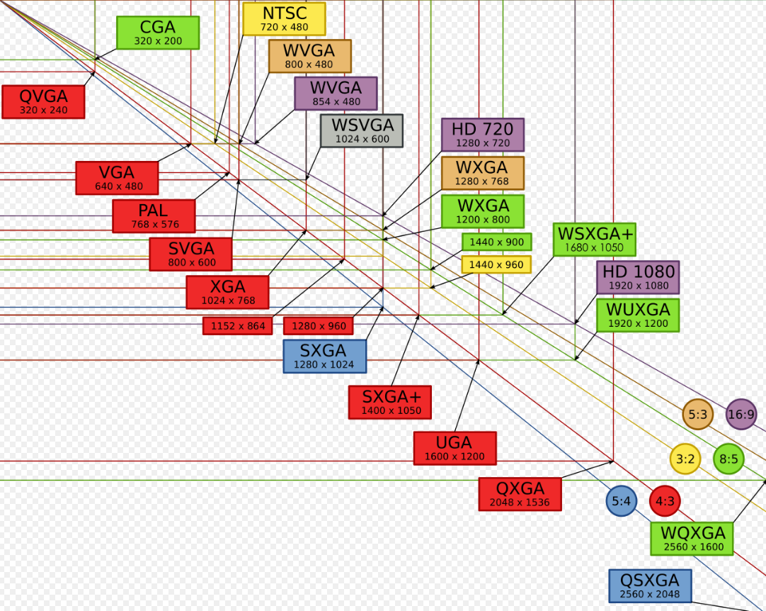
1920 is now considered as the default monitor (look at the statistics), and at the time of the creation of the bootstrap, they fixed 1170 as the minimum acceptable desktop resolution, so the content is entered at this size (considering fields of 15 pixels, this is a resolution of 1200 * 800) as the most used resolution.
Beyond 1280 is a popular width at different resolutions, like a breakpoint. But already without margins.
960 is due to the framework of the same name, where this number is used for fallback at 1024*968 resolution plus margins, rounded to normal divisible number.
The number 960 (like the others you listed) was chosen because it is convenient to divide into columns with fields. On 2/4/6/8/10/12/16/24
Take the width depending on how you will typeset. And, well, wait, if you get a ready-made design, then you won’t be able to “take” some content width, but you will have to work with what was given.
Again, whether you use frameworks will also limit / simplify the choice of width.
You don't need to score. If they scored on the width of the content, then they either just painted some of their own width, but still the same, or even spread across sections / blocks. You may well then reduce everything to a single width that you yourself have chosen, if the customer agrees and pixel perfect is not required for the content area (usually not, and it is quite explained to the customer by the requirements of "compliance for old monitors" or something like that, after which they agree)
Depends mainly on this:
You probably need to understand the grid, for example for Bootstrap, and use it to saw your bike, or just use it
Didn't find what you were looking for?
Ask your questionAsk a Question
731 491 924 answers to any question