Answer the question
In order to leave comments, you need to log in
What is the best way to implement this kind of layout with pseudo-elements?
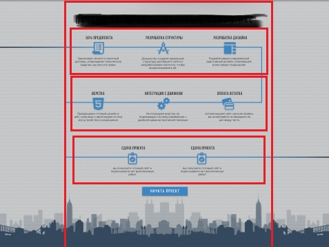
Good afternoon, connoisseurs :) Tell me, how best to implement blue lines in this layout? 
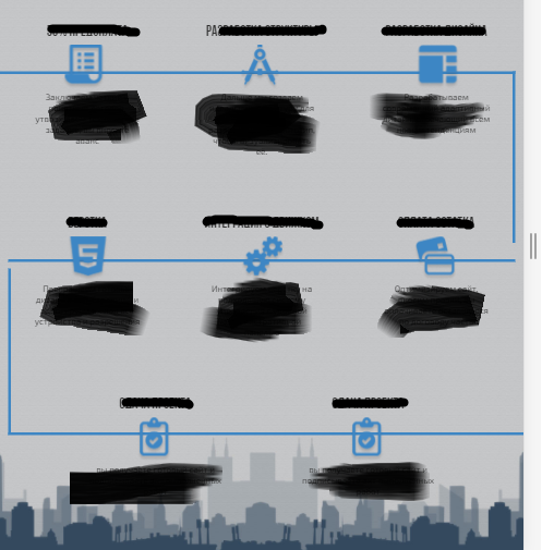
(I sketched the main blocks with red lines to make it clear) So, I made three lines that pass through the icons as if through ::before for each of the three containers. Then I made two side vertical lines through ::before and ::after at the first element of the topmost of the three containers and the last element of the third container. At a certain screen width, the vertical lines break like this:
Is there any other way to make the layout more adaptive and versatile, or not bother and just work with breakpoints? It’s just that the gap is due to the expansion of content in height, due to narrowing, but I don’t understand how to make a universal solution here. Because in the initial form, the vertical lines have a height limit so that they do not intersect the horizontal lines, immediately when narrowing, a constant increase in height will occur ...
Answer the question
In order to leave comments, you need to log in
Didn't find what you were looking for?
Ask your questionAsk a Question
731 491 924 answers to any question